给直方图和线图添加误差棒 准备数据
这里使用ToothGrowth 数据集。它描述了维他命C对Guinea猪牙齿的生长影响。包含了三种不同的剂量(Vitamin C (0.5, 1, and 2 mg))和相应的两种不同使用方法( [orange juice (OJ) or ascorbic acid (VC)])。
library(ggplot2) df <- ToothGrowth df$dose <- as.factor(df$dose) head(df) ## len supp dose ## 1 4.2 VC 0.5 ## 2 11.5 VC 0.5 ## 3 7.3 VC 0.5 ## 4 5.8 VC 0.5 ## 5 6.4 VC 0.5 ## 6 10.0 VC 0.5
- len :牙齿长度
- dose : 剂量 (0.5, 1, 2) 单位是毫克
- supp : 支持类型 (VC or OJ)
在下面的例子中,我们将绘制每组中牙齿长度的均值。标准差用来绘制图形中的误差棒。
首先,下面的帮助函数会用来计算每组中兴趣变量的均值和标准差:
#+++++++++++++++++++++++++ # Function to calculate the mean and the standard deviation # for each group #+++++++++++++++++++++++++ # data : a data frame # varname : the name of a column containing the variable #to be summariezed # groupnames : vector of column names to be used as # grouping variables data_summary <- function(data, varname, groupnames){ require(plyr) summary_func <- function(x, col){ c(mean = mean(x[[col]], na.rm=TRUE), sd = sd(x[[col]], na.rm=TRUE)) } data_sum<-ddply(data, groupnames, .fun=summary_func, varname) data_sum <- rename(data_sum, c("mean" = varname)) return(data_sum) }
统计数据 :
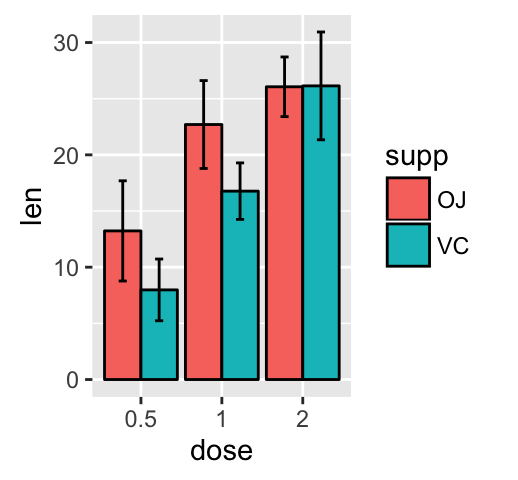
df2 <- data_summary(ToothGrowth, varname="len", groupnames=c("supp", "dose")) # 把剂量转换为因子变量 df2$dose=as.factor(df2$dose) head(df2) ## supp dose len sd ## 1 OJ 0.5 13.23 4.459709 ## 2 OJ 1 22.70 3.910953 ## 3 OJ 2 26.06 2.655058 ## 4 VC 0.5 7.98 2.746634 ## 5 VC 1 16.77 2.515309 ## 6 VC 2 26.14 4.797731 有误差棒的直方图
函数 geom_errorbar()可以用来生成误差棒:
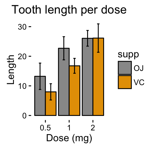
library(ggplot2) # Default bar plot p<- ggplot(df2, aes(x=dose, y=len, fill=supp)) + geom_bar(stat="identity", color="black", position=position_dodge()) + geom_errorbar(aes(ymin=len-sd, ymax=len+sd), width=.2, position=position_dodge(.9)) print(p) # Finished bar plot p+labs(title="Tooth length per dose", x="Dose (mg)", y = "Length")+ theme_classic() + scale_fill_manual(values=c('#999999','#E69F00'))
img
img
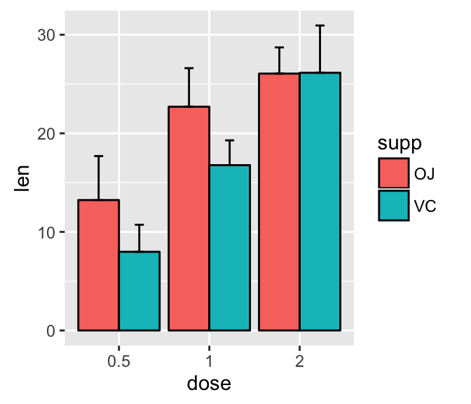
注意,你可以选择只保留上方的误差棒:
# Keep only upper error bars ggplot(df2, aes(x=dose, y=len, fill=supp)) + geom_bar(stat="identity", color="black", position=position_dodge()) + geom_errorbar(aes(ymin=len, ymax=len+sd), width=.2, position=position_dodge(.9))
img
阅读ggplot2直方图更多信息 : ggplot2 bar graphs
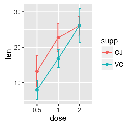
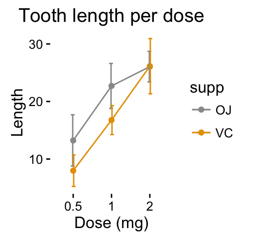
有误差棒的线图 # Default line plot p<- ggplot(df2, aes(x=dose, y=len, group=supp, color=supp)) + geom_line() + geom_point()+ geom_errorbar(aes(ymin=len-sd, ymax=len+sd), width=.2, position=position_dodge(0.05)) print(p) # Finished line plot p+labs(title="Tooth length per dose", x="Dose (mg)", y = "Length")+ theme_classic() + scale_color_manual(values=c('#999999','#E69F00'))
img
img
你也可以使用函数 geom_pointrange() 或 geom_linerange() 替换 geom_errorbar()
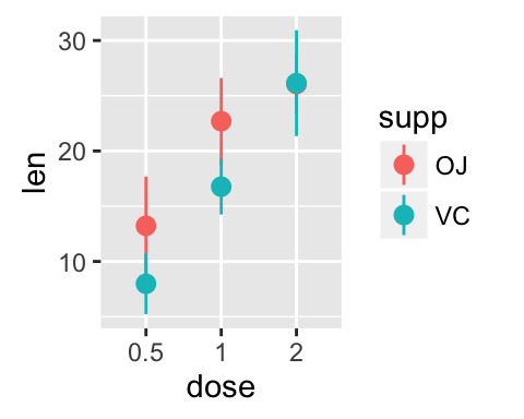
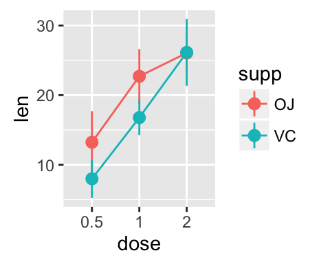
# Use geom_pointrange ggplot(df2, aes(x=dose, y=len, group=supp, color=supp)) + geom_pointrange(aes(ymin=len-sd, ymax=len+sd)) # Use geom_line()+geom_pointrange() ggplot(df2, aes(x=dose, y=len, group=supp, color=supp)) + geom_line()+ geom_pointrange(aes(ymin=len-sd, ymax=len+sd))
img
img
阅读ggplot2线图更多信息: ggplot2 line plots
有均值和误差棒的点图
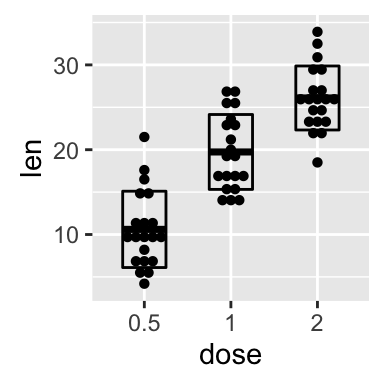
使用函数 geom_dotplot() and stat_summary() :
The mean +/- SD can be added as a crossbar , a error bar or a pointrange :
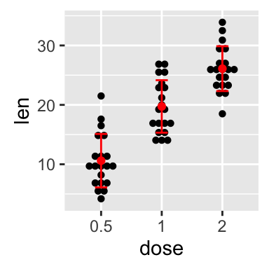
p <- ggplot(df, aes(x=dose, y=len)) + geom_dotplot(binaxis='y', stackdir='center') # use geom_crossbar() p + stat_summary(fun.data="mean_sdl", fun.args = list(mult=1), geom="crossbar", width=0.5) # Use geom_errorbar() p + stat_summary(fun.data=mean_sdl, fun.args = list(mult=1), geom="errorbar", color="red", width=0.2) + stat_summary(fun.y=mean, geom="point", color="red") # Use geom_pointrange() p + stat_summary(fun.data=mean_sdl, fun.args = list(mult=1), geom="pointrange", color="red")
img
img
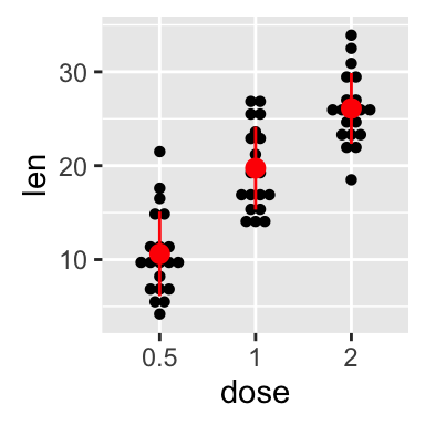
img
阅读ggplot2点图更多信息: ggplot2 dot plot
线程信息
This analysis has been performed using R software (ver. 3.2.4) and ggplot2 (ver. 2.1.0)- 本文固定链接: https://maimengkong.com/image/1265.html
- 转载请注明: : 萌小白 2022年11月8日 于 卖萌控的博客 发表
- 百度已收录