作者简介Introduction
taoyan:伪码农,R语言爱好者,爱开源。
个人博客: https://ytlogos.github.io/
公众号:生信大讲堂
上次提了下theme(),本文将专门讲解一下。凡是与数据无关的图形设置可以归为主题类,ggplot2中主题设置十分多,根本不可能讲解完,只能稍微讲点皮毛,灵活运用才是关键,本文只是总体上略作介绍。正如R语言大神Hadley Wickham所讲的,ggplot2只是提供了一个平台,可以根据自己的需要无限创造。理论上来讲,只要能想到的图形,ggplot2都能实现。
library(ggplot2)
#我们先来看看ggplot2默认的主题设置函数theme_gray()的源代码
theme_gray#函数名不加括号可获得函数源代码
## function (base_size = 11, base_family = "")
## {
## half_line <- base_size/2
## theme(line = element_line(colour = "black", size = 0.5, linetype = 1,
## lineend = "butt"), rect = element_rect(fill = "white",
## colour = "black", size = 0.5, linetype = 1), text = element_text(family = base_family,
## face = "plain", colour = "black", size = base_size, lineheight = 0.9,
## hjust = 0.5, vjust = 0.5, angle = 0, margin = margin(),
## debug = FALSE), axis.line = element_blank(), axis.line.x = NULL,
## axis.line.y = NULL, axis.text = element_text(size = rel(0.8),
## colour = "grey30"), axis.text.x = element_text(margin = margin(t = 0.8 *
## half_line/2), vjust = 1), axis.text.x.top = element_text(margin = margin(b = 0.8 * ## half_line/2), vjust = 0), axis.text.y = element_text(margin = margin(r = 0.8 *
## half_line/2), hjust = 1), axis.text.y.right = element_text(margin = margin(l = 0.8 * ## half_line/2), hjust = 0), axis.ticks = element_line(colour = "grey20"),
## axis.ticks.length = unit(half_line/2, "pt"), axis.title.x = element_text(margin = margin(t = half_line),
## vjust = 1), axis.title.x.top = element_text(margin = margin(b = half_line),
## vjust = 0), axis.title.y = element_text(angle = 90,
## margin = margin(r = half_line), vjust = 1), axis.title.y.right = element_text(angle = -90,
## margin = margin(l = half_line), vjust = 0), legend.background = element_rect(colour = NA),
## legend.spacing = unit(0.4, "cm"), legend.spacing.x = NULL,
## legend.spacing.y = NULL, legend.margin = margin(0.2,
## 0.2, 0.2, 0.2, "cm"), legend.key = element_rect(fill = "grey95",
## colour = "white"), legend.key.size = unit(1.2, "lines"),
## legend.key.height = NULL, legend.key.width = NULL, legend.text = element_text(size = rel(0.8)),
## legend.text.align = NULL, legend.title = element_text(hjust = 0),
## legend.title.align = NULL, legend.position = "right",
## legend.direction = NULL, legend.justification = "center",
## legend.box = NULL, legend.box.margin = margin(0, 0, 0,
## 0, "cm"), legend.box.background = element_blank(),
## legend.box.spacing = unit(0.4, "cm"), panel.background = element_rect(fill = "grey92",
## colour = NA), panel.border = element_blank(), panel.grid.major = element_line(colour = "white"),
## panel.grid.minor = element_line(colour = "white", size = 0.25),
## panel.spacing = unit(half_line, "pt"), panel.spacing.x = NULL,
## panel.spacing.y = NULL, panel.ontop = FALSE, strip.background = element_rect(fill = "grey85",
## colour = NA), strip.text = element_text(colour = "grey10",
## size = rel(0.8)), strip.text.x = element_text(margin = margin(t = half_line,
## b = half_line)), strip.text.y = element_text(angle = -90,
## margin = margin(l = half_line, r = half_line)), strip.placement = "inside",
## strip.placement.x = NULL, strip.placement.y = NULL, strip.switch.pad.grid = unit(0.1,
## "cm"), strip.switch.pad.wrap = unit(0.1, "cm"), plot.background = element_rect(colour = "white"),
## plot.title = element_text(size = rel(1.2), hjust = 0,
## vjust = 1, margin = margin(b = half_line * 1.2)),
## plot.subtitle = element_text(size = rel(0.9), hjust = 0,
## vjust = 1, margin = margin(b = half_line * 0.9)),
## plot.caption = element_text(size = rel(0.9), hjust = 1,
## vjust = 1, margin = margin(t = half_line * 0.9)),
## plot.margin = margin(half_line, half_line, half_line,
## half_line), complete = TRUE)
## }
## <environment: namespace:ggplot2>
可以看出,源代码主要是theme()函数,设置也很简单:theme(..., complete = FALSE),但是其内含的参数则十分多。
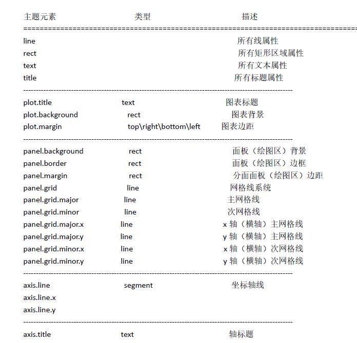
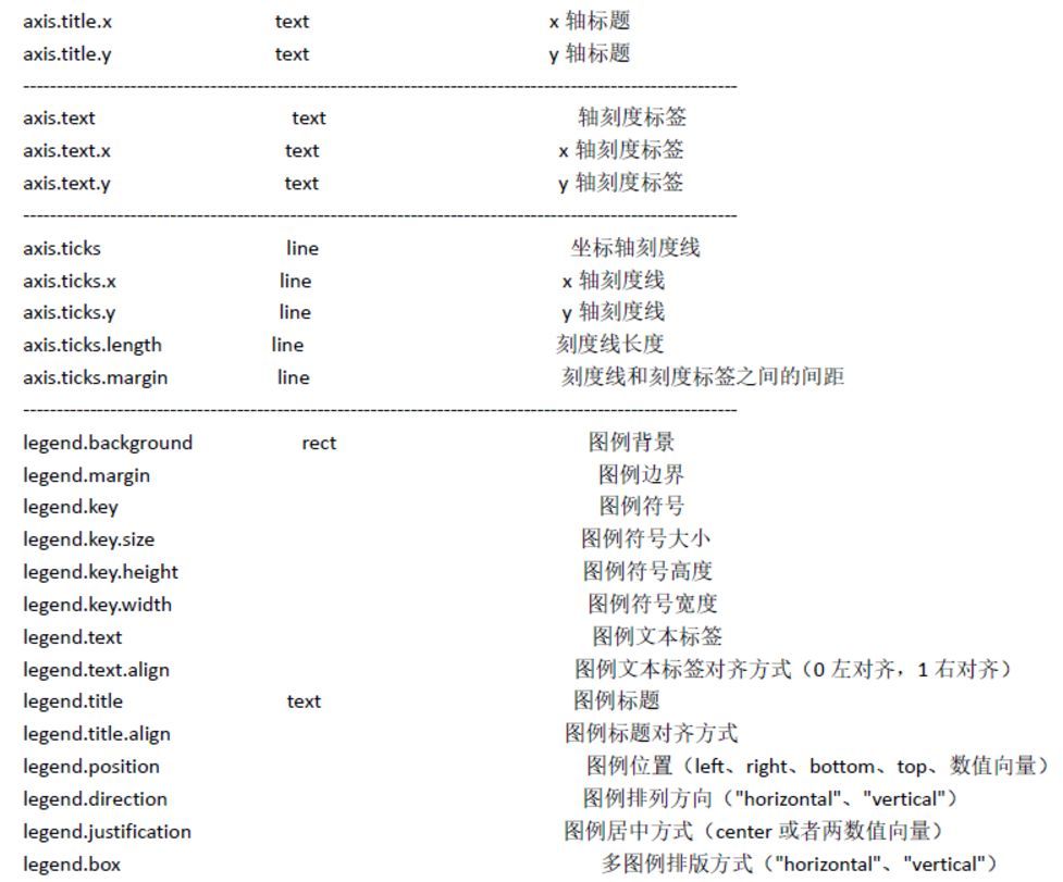
几乎所有元素在theme()里都使用element_line,element_rect,element_text和element_blank函数设置. 下面就举例稍微讲解一下
#利用数据集mtcars演示head(mtcars)
#先创建p图层
p<- ggplot(data=mtcars, aes(x=wt, y=mpg))+
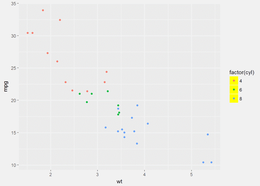
geom_point(aes(color=factor(cyl)))#先试试图例修改
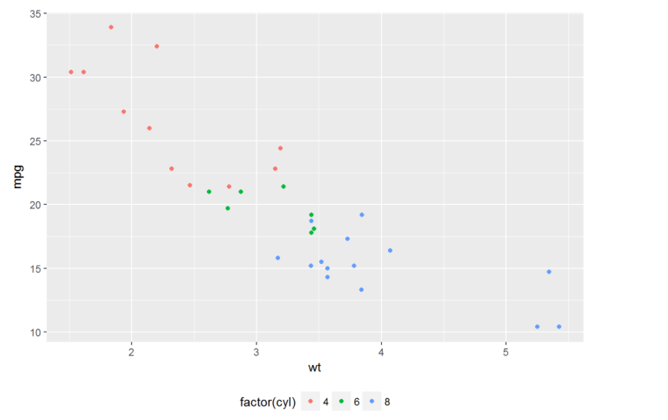
p+theme(legend.position = "none")#无图例
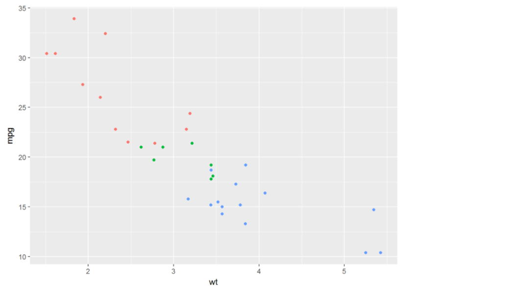
p+theme(legend.position = "bottom")#图例在底部
#也可以自定义
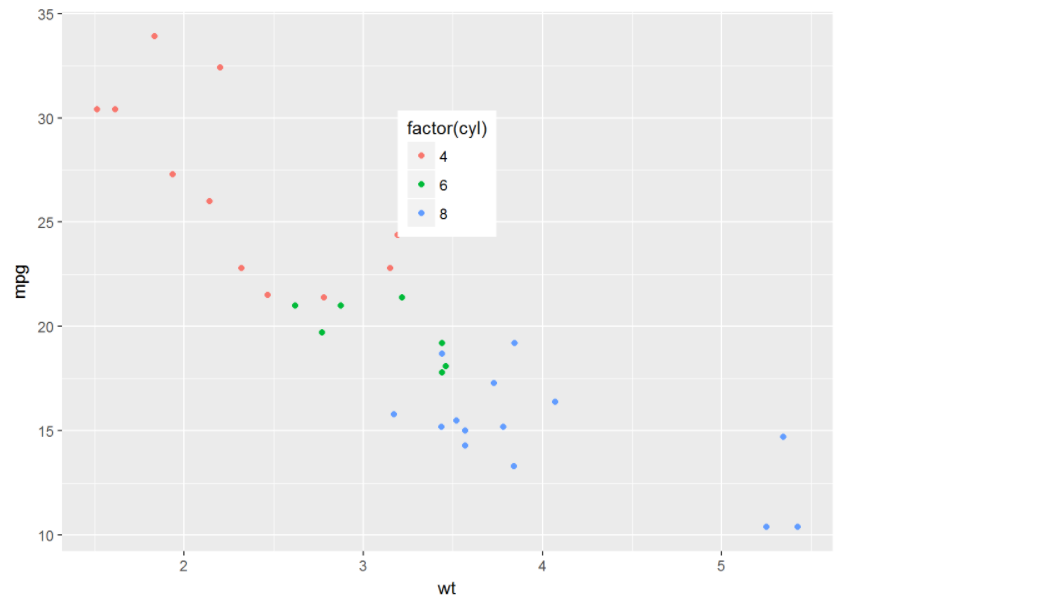
p+theme(legend.position = c(0.5, 0.7))
#为图例加边界
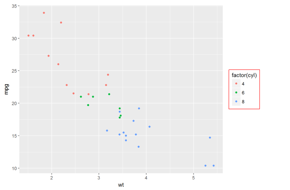
p+theme(legend.background = element_rect(color="red"))
#或者为图例中的每个元素进行设置,如加边界
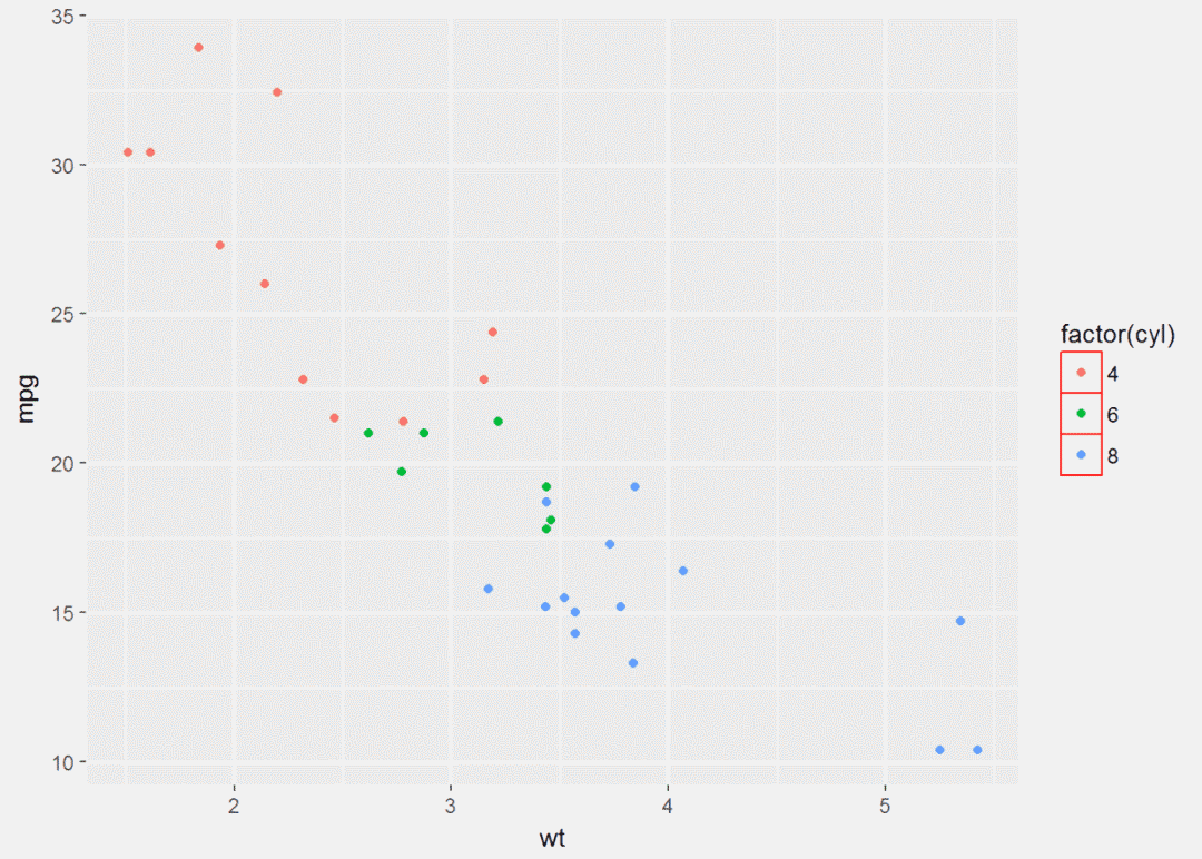
p+theme(legend.key =element_rect(color="red"))
#进行填充
p+theme(legend.key = element_rect(fill="yellow"))
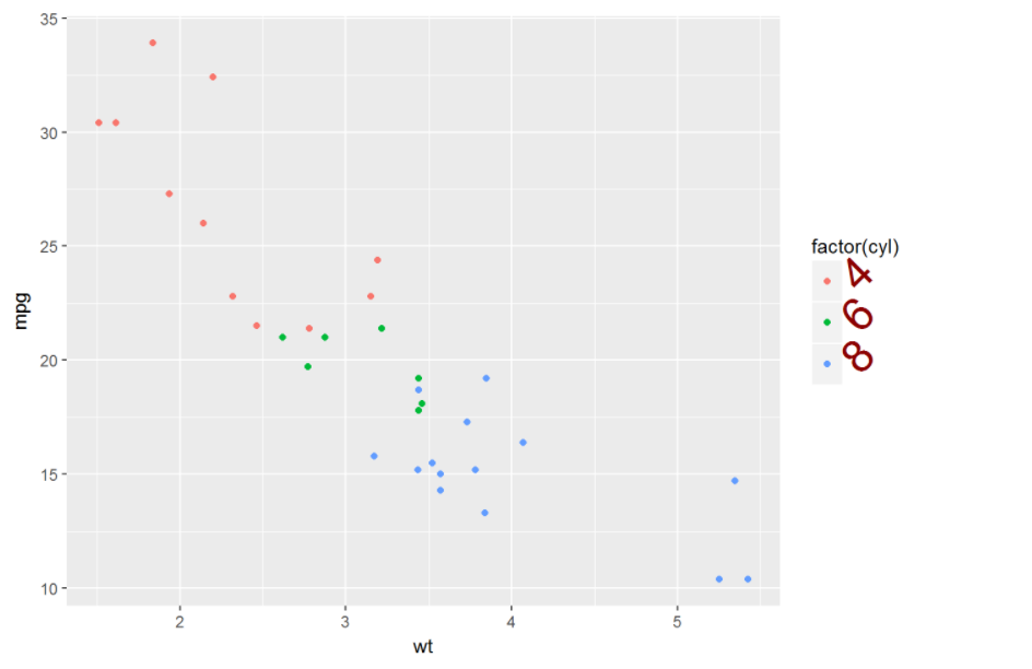
#图例内容字体大小、颜色、角度等设置
p+theme(legend.text = element_text(size=25, color="darkred", angle=45))
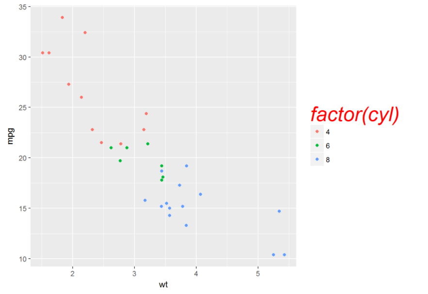
#为图例标题设置字体、颜色、大小等
p+theme(legend.title = element_text(face="italic", size=25, color="red"))
接下来是坐标以及网格等的自定义
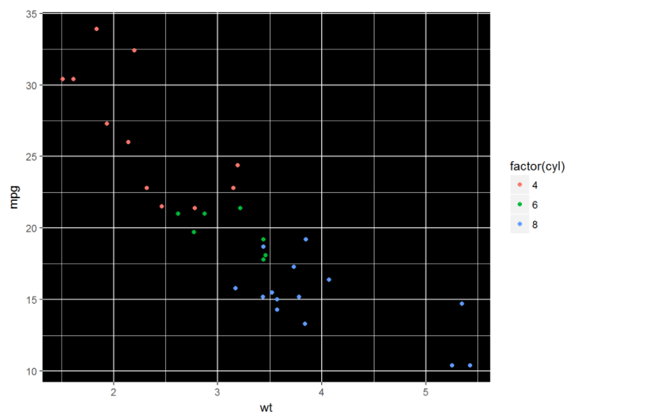
#修改背景颜色
p+theme(panel.background = element_rect(fill="black"))
#修改边界线类型、颜色
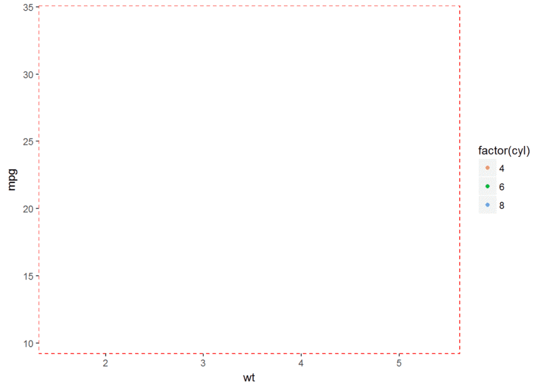
p+theme(panel.border = element_rect(linetype = "dashed", color="red"))
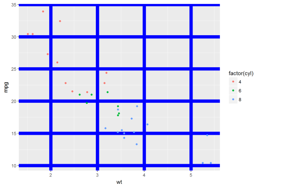
#修改网格线p+theme(panel.grid.major = element_line(color="blue", size= 3))
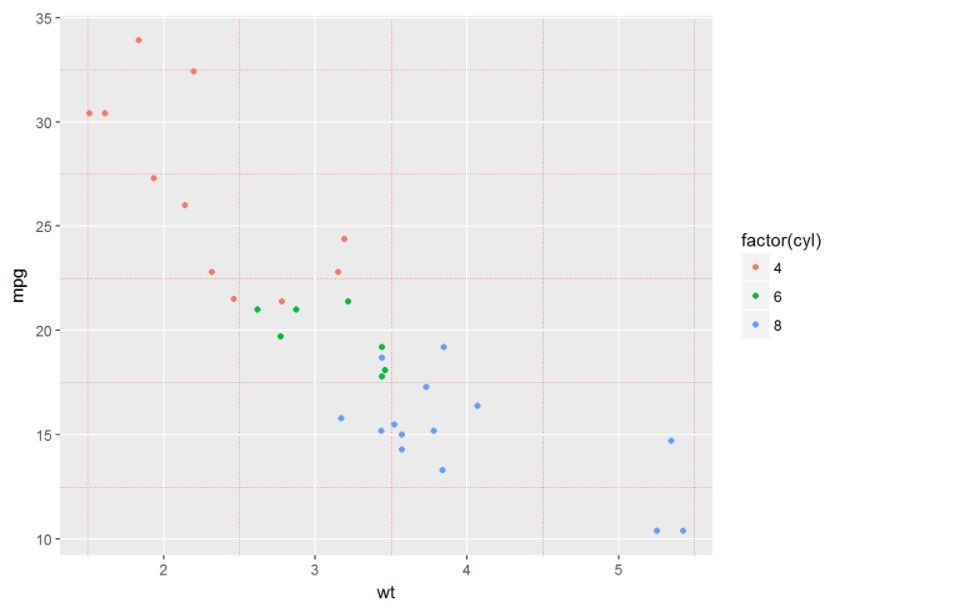
p+theme(panel.grid.minor = element_line(linetype = "dotted", color="red"))
还可以修改x、y轴等,这里懒得讲了,有兴趣的可以自己捣鼓捣鼓
了解theme之后就可以自己定义自己的主题,以后作图就直接像格式刷一样就行
#下面是我比较常用的主题,画图时刷一下就行了
windowsFonts(CA=windowsFont("Calibri"))
mytheme <- theme_bw()+
theme(legend.position = 'top', panel.border = element_blank(),
panel.grid.major = element_line(linetype = 'dashed'), panel.grid.minor =
element_blank(), legend.text = element_text(size=9,color='#003087',family = "CA"),
plot.title = element_text(size=15,color="#003087",family = "CA"), legend.key =
element_blank(), axis.text = element_text(size=10,color='#003087',family = "CA"),
strip.text = element_text(size=12,color="#EF0808",family = "CA"),
strip.background = element_blank())
pie_theme <- mytheme+
theme(axis.text = element_blank(), axis.ticks = element_blank(), axis.title =
element_blank(), panel.grid.major = element_blank())
myline_blue <- geom_line(color="#085A9C", size=2)
myline_red <- geom_line(color="#EF0808",size=2)
myarea <- geom_area(color=NA,fill="#003087",alpha=0.2)
mypoint <- geom_point(size=3,shape=21,color="#003087",fill="white")
mybar <- geom_bar(fill="#0C8DC4",stat = "identity")
mycolor_3 <- scale_fill_manual(values = c("#085A9C","#EF0808","#526373"))
mycolor_7 <- scale_fill_manual(values=c ("#085A9C","#EF0808","#526373","#FFFFE7","#FF9418","#219431","#9C52AD"))
mycolor_line_7 <- scale_color_manual(values=c ("#085A9C","#EF0808","#526373","#FFFFE7","#FF9418","#219431","#9C52AD"))
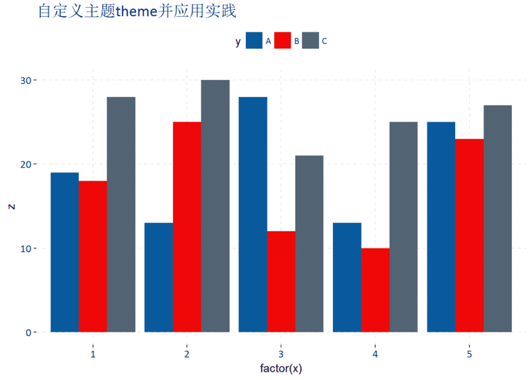
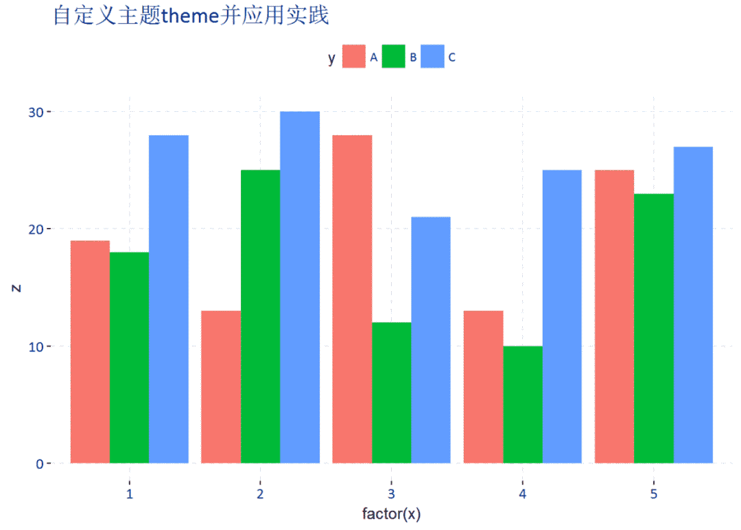
#可以来刷一刷#随便建个数据集
x <-rep(1:5, each = 3)
y <-rep(c('A','B','C'),times = 5)
set.seed(1111)
z <-round(runif(min = 10, max = 30, n = 15))
df <-data.frame(x = x, y = y, z = z)
head(df)
## x y z
## 1 1 A 19
## 2 1 B 18
## 3 1 C 28
## 4 2 A 13
## 5 2 B 25
## 6 2 C 30
#柱形图
(p1 <- ggplot(data=df, aes(x=factor(x), y=z, fill=y))+
geom_bar(stat = "identity", position = "dodge")+
ggtitle("自定义主题theme并应用实践"))+
xlab("随便定义了个x")+ylab("随机数")
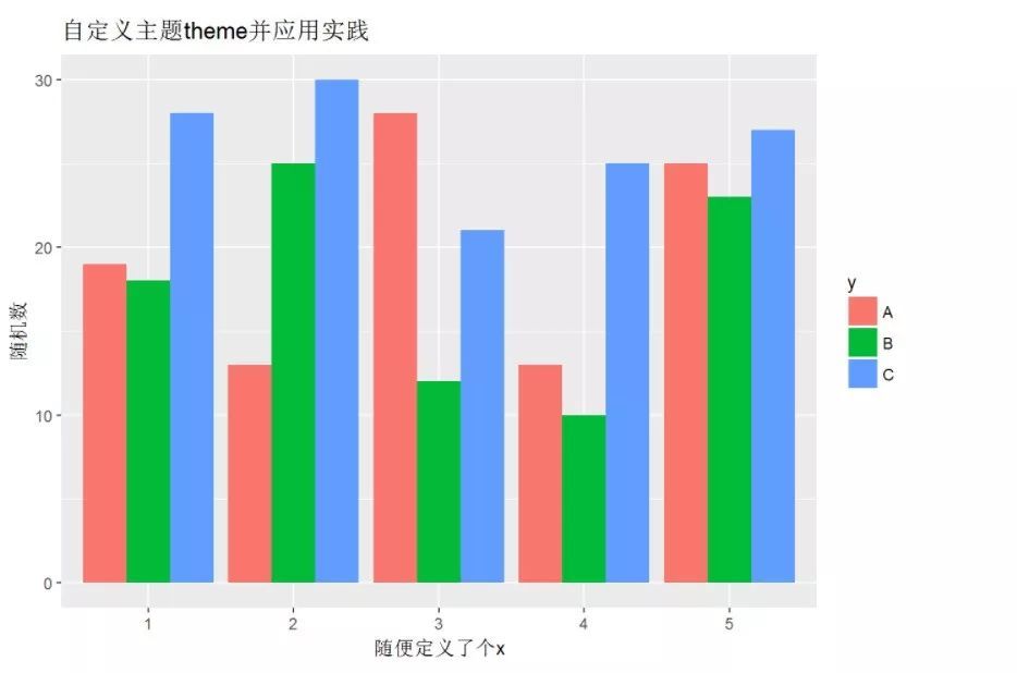
p1+mytheme
p1+mytheme+mycolor_7

还有线图、饼图等有兴趣的也可以自己刷一刷,你会发现ggplot2的魅力所在就是它拥有无穷的可能性。
- 本文固定链接: https://maimengkong.com/image/1239.html
- 转载请注明: : 萌小白 2022年10月5日 于 卖萌控的博客 发表
- 百度已收录