因此,对从业者而言,用 R 语言绘制热图就成了一项最通用的必备技能。本文将以 R 语言为基础,详细介绍热图绘制中遇到的各种问题和注意事项。原文作者 taoyan,原载于作者个人博客,AI 研习社获授权。
简介
本文将绘制静态与交互式热图,需要使用到以下R包和函数:
● heatmap():用于绘制简单热图的函数
● heatmap.2():绘制增强热图的函数
● d3heatmap:用于绘制交互式热图的R包
● ComplexHeatmap:用于绘制、注释和排列复杂热图的R&bioconductor包(非常适用于基因组数据分析)
数据准备
使用R内置数据集 mtcars
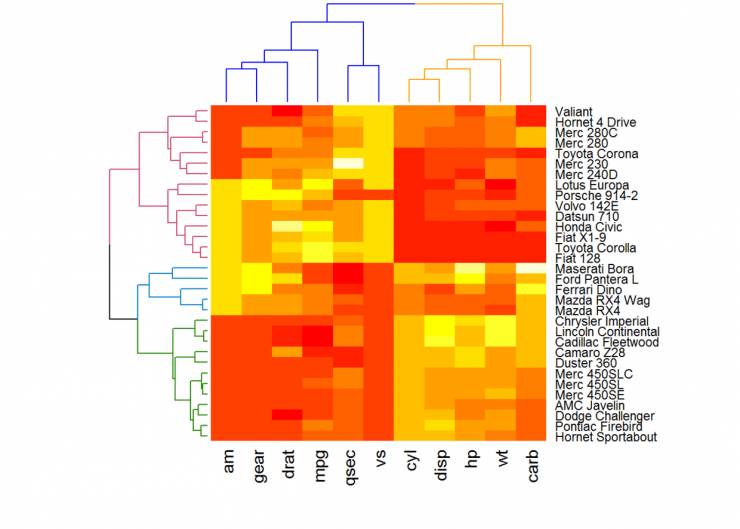
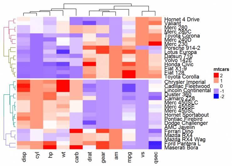
使用基本函数绘制简单简单热图df <- as.matrix((scale(mtcars))) #归一化、矩阵化
主要是函数 heatmap(x, scale="row")
● x: 数据矩阵
● scale:表示不同方向,可选值有:row, columa, none
● Default plotheatmap(df, scale = "none")
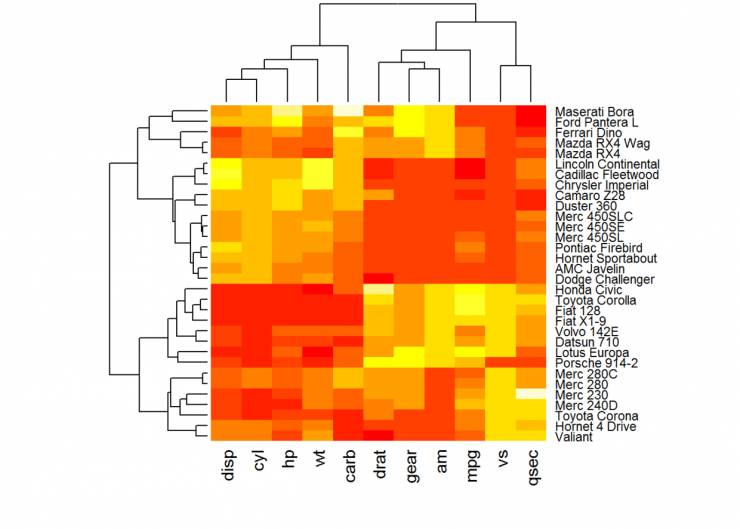
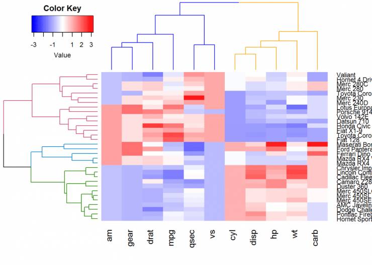
Use custom colorscol <- colorRampPalette(c("red", "white", "blue"))(256)heatmap(df, scale = "none", col=col)
#Use RColorBrewer color palette names
library(RColorBrewer)col <- colorRampPalette(brewer.pal(10, "RdYlBu"))(256)#自设置调色板dim(df)#查看行列数
## [1] 32 11
heatmap(df, scale = "none", col=col, RowSideColors = rep(c("blue", "pink"), each=16),
ColSideColors = c(rep("purple", 5), rep("orange", 6)))
#参数RowSideColors和ColSideColors用于分别注释行和列颜色等,可help(heatmap)详情
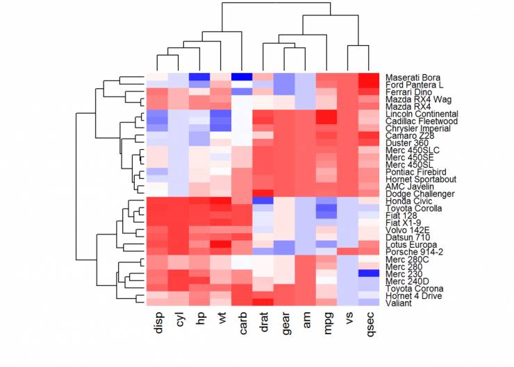
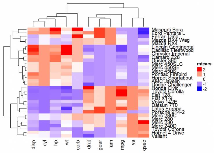
增强热图
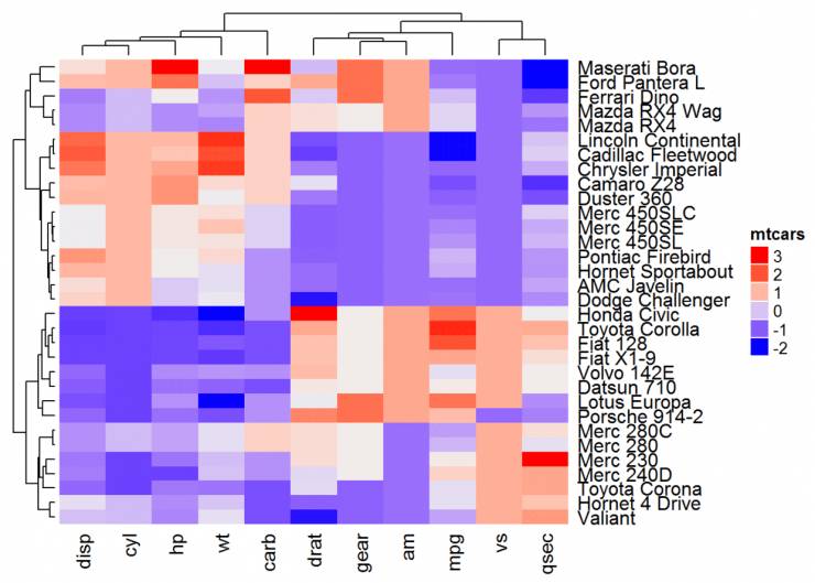
函数 heatmap.2()
在热图绘制方面提供许多扩展,此函数包装在 gplots 包里。
library(gplots)heatmap.2(df, scale = "none", col=bluered(100),
trace = "none", density.info = "none")#还有其他参数可参考help(heatmap.2())
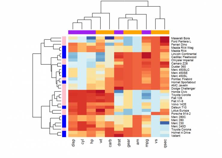
交互式热图绘制
d3heatmap 包可用于生成交互式热图绘制,可通过以下代码生成:
if (!require("devtools"))
install.packages("devtools")
devtools::install_github("rstudio/d3heatmap")
函数 d3heatmap() 用于创建交互式热图,有以下功能:
● 将鼠标放在感兴趣热图单元格上以查看行列名称及相应值
● 可选择区域进行缩放
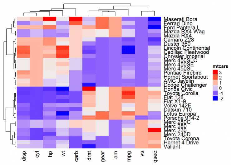
library(d3heatmap)d3heatmap(df, colors = "RdBu", k_row = 4, k_col = 2)
k_row、k_col分别指定用于对行列中树形图分支进行着色所需组数。进一步信息可help(d3heatmap())获取。
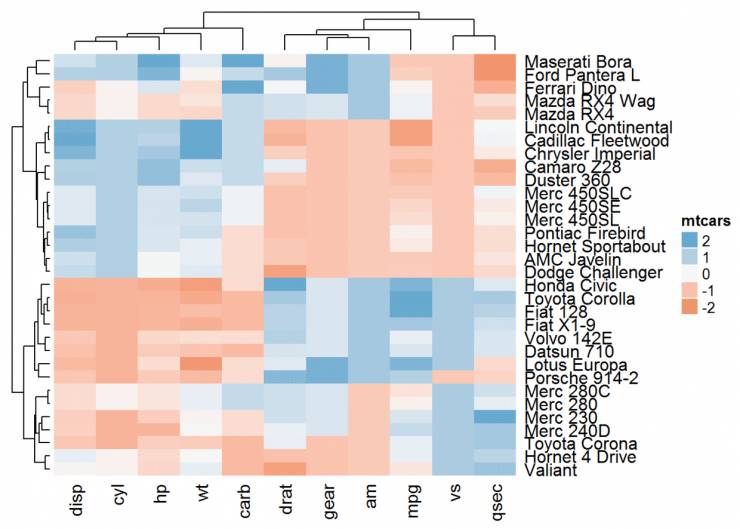
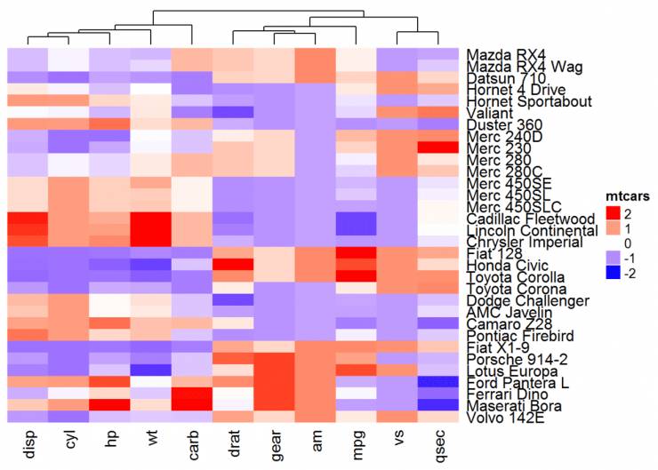
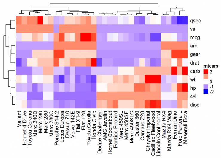
使用 dendextend 包增强热图
软件包 dendextend 可以用于增强其他软件包的功能
library(dendextend)# order for rows
Rowv <- mtcars %>% scale %>% dist %>%
hclust %>% as.dendrogram %>%
set("branches_k_color", k = 3) %>%
set("branches_lwd", 1.2) %>% ladderize# Order for columns#
We must transpose the data
Colv <- mtcars %>% scale %>% t %>% dist %>%
hclust %>% as.dendrogram %>%
set("branches_k_color", k = 2, value = c("orange", "blue")) %>% set("branches_lwd", 1.2) %>% ladderize
#增强heatmap()函数
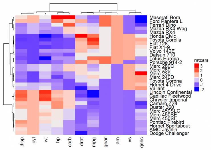
heatmap(df, Rowv = Rowv, Colv = Colv, scale = "none")
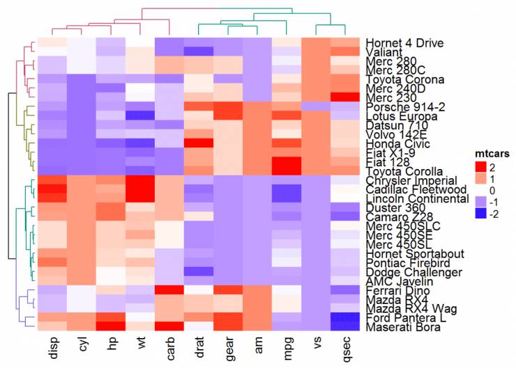
#增强heatmap.2()函数
heatmap.2(df, scale = "none", col = bluered(100), Rowv = Rowv, Colv = Colv, trace = "none", density.info = "none")
绘制复杂热图#增强交互式绘图函数
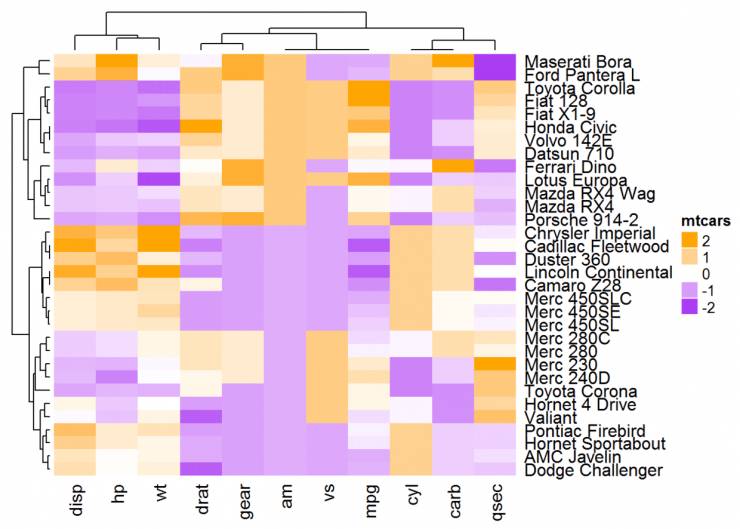
d2heatmap()d3heatmap(scale(mtcars), colors = "RdBu", Rowv = Rowv, Colv = Colv)
ComplexHeatmap 包是 bioconductor 包,用于绘制复杂热图,它提供了一个灵活的解决方案来安排和注释多个热图。它还允许可视化来自不同来源的不同数据之间的关联热图。可通过以下代码安装:
if (!require("devtools")) install.packages("devtools")
devtools::install_github("jokergoo/ComplexHeatmap")
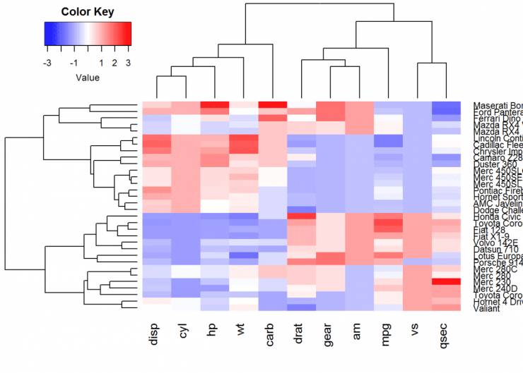
ComplexHeatmap 包的主要功能函数是 Heatmap(),格式为:Heatmap(matrix, col, name)
● matrix:矩阵
● col:颜色向量(离散色彩映射)或颜色映射函数(如果矩阵是连续数)
● name:热图名称
library(ComplexHeatmap)
Heatmap(df, name = "mtcars")
使用调色板#自设置颜色
library(circlize)
Heatmap(df, name = "mtcars", col = colorRamp2(c(-2, 0, 2), c("green", "white", "red")))
Heatmap(df, name = "mtcars",col = colorRamp2(c(-2, 0, 2), brewer.pal(n=3, name="RdBu")))
热图及行列标题设置#自定义颜色
mycol <- colorRamp2(c(-2, 0, 2), c("blue", "white", "red"))
Heatmap(df, name = "mtcars", col = mycol, column_title = "Column title", row_title =
"Row title")
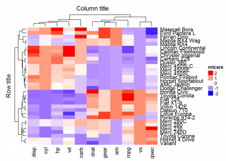
注意,行标题的默认位置是“left”,列标题的默认是“top”。可以使用以下选项更改:
● row_title_side:允许的值为“左”或“右”(例如:row_title_side =“right”)
● column_title_side:允许的值为“top”或“bottom”(例如:column_title_side =“bottom”) 也可以使用以下选项修改字体和大小:
● row_title_gp:用于绘制行文本的图形参数
● column_title_gp:用于绘制列文本的图形参数
Heatmap(df, name = "mtcars", col = mycol, column_title = "Column title",
column_title_gp = gpar(fontsize = 14, fontface = "bold"),
row_title = "Row title", row_title_gp = gpar(fontsize = 14, fontface = "bold"))

在上面的R代码中,fontface的可能值可以是整数或字符串:1 = plain,2 = bold,3 =斜体,4 =粗体斜体。如果是字符串,则有效值为:“plain”,“bold”,“italic”,“oblique”和“bold.italic”。
显示行/列名称:
● show_row_names:是否显示行名称。默认值为TRUE
● show_column_names:是否显示列名称。默认值为TRUE
Heatmap(df, name = "mtcars", show_row_names = FALSE)

更改聚类外观
默认情况下,行和列是包含在聚类里的。可以使用参数修改:
● cluster_rows = FALSE。如果为TRUE,则在行上创建集群
● cluster_columns = FALSE。如果为TRUE,则将列置于簇上
# Inactivate cluster on rows
Heatmap(df, name = "mtcars", col = mycol, cluster_rows = FALSE)
如果要更改列集群的高度或宽度,可以使用选项column_dend_height 和 row_dend_width:
Heatmap(df, name = "mtcars", col = mycol, column_dend_height = unit(2, "cm"),
row_dend_width = unit(2, "cm") )
我们还可以利用 color_branches() 自定义树状图外观
library(dendextend)
row_dend = hclust(dist(df)) # row clustering
col_dend = hclust(dist(t(df))) # column clustering
Heatmap(df, name = "mtcars", col = mycol, cluster_rows =
color_branches(row_dend, k = 4), cluster_columns = color_branches(col_dend, k = 2))
不同的聚类距离计算方式
参数 clustering_distance_rows 和 clustering_distance_columns
用于分别指定行和列聚类的度量标准,允许的值有“euclidean”, “maximum”, “manhattan”, “canberra”, “binary”, “minkowski”, “pearson”, “spearman”, “kendall”。
Heatmap(df, name = "mtcars", clustering_distance_rows = "pearson",
clustering_distance_columns = "pearson")

#也可以自定义距离计算方式
Heatmap(df, name = "mtcars", clustering_distance_rows = function(m) dist(m))

Heatmap(df, name = "mtcars", clustering_distance_rows = function(x, y) 1 - cor(x, y))
请注意,在上面的R代码中,通常为指定行聚类的度量的参数 clustering_distance_rows显示示例。建议对参数clustering_distance_columns(列聚类的度量标准)使用相同的度量标准。
# Clustering metric function
robust_dist = function(x, y) {
qx = quantile(x, c(0.1, 0.9)) qy = quantile(y, c(0.1, 0.9)) l = x > qx[1] & x < qx[2] & y
> qy[1] & y < qy[2] x = x[l] y = y[l] sqrt(sum((x - y)^2))}
# Heatmap
Heatmap(df, name = "mtcars", clustering_distance_rows = robust_dist,
clustering_distance_columns = robust_dist,
col = colorRamp2(c(-2, 0, 2), c("purple", "white", "orange")))
聚类方法
参数clustering_method_rows和clustering_method_columns可用于指定进行层次聚类的方法。允许的值是hclust()函数支持的值,包括“ward.D”,“ward.D2”,“single”,“complete”,“average”。
Heatmap(df, name = "mtcars", clustering_method_rows = "ward.D",
clustering_method_columns = "ward.D")
热图拆分
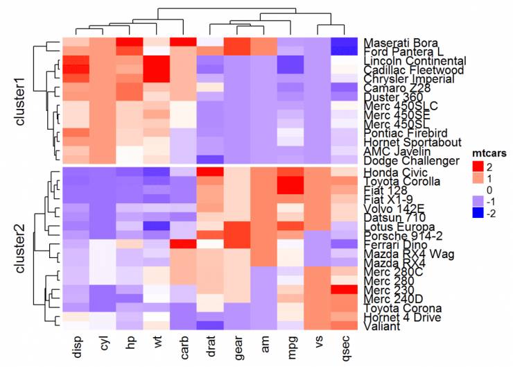
有很多方法来拆分热图。一个解决方案是应用k-means使用参数km。
在执行k-means时使用set.seed()函数很重要,这样可以在稍后精确地再现结果
set.seed(1122)
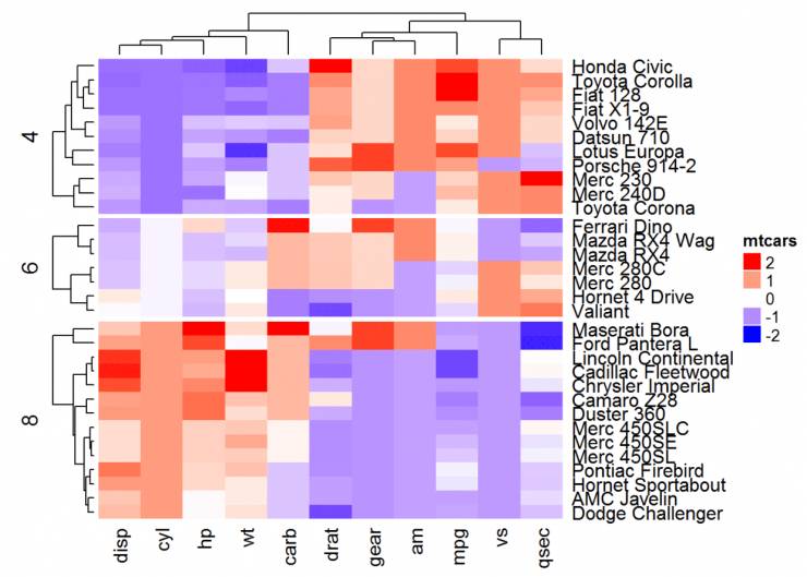
# split into 2 groupsHeatmap(df, name = "mtcars", col = mycol, k = 2)
# split by a vector specifying row classes, 有点类似于ggplot2里的分面
Heatmap(df, name = "mtcars", col = mycol, split = mtcars$cyl )
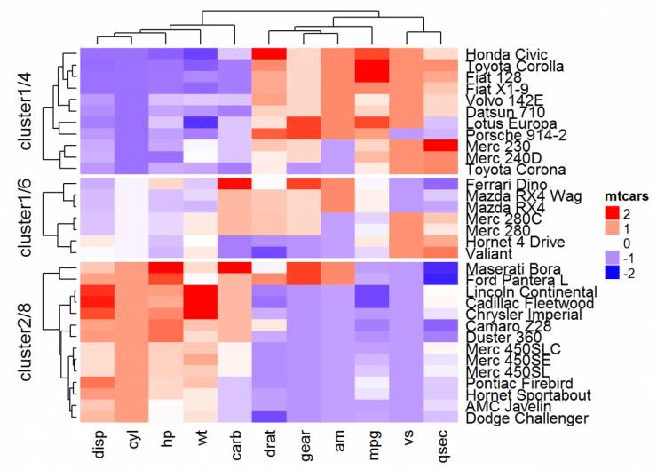
#split也可以是一个数据框,其中不同级别的组合拆分热图的行。
# Split by combining multiple variables
Heatmap(df, name ="mtcars", col = mycol, split = data.frame(cyl = mtcars$cyl, am = mtcars$am))
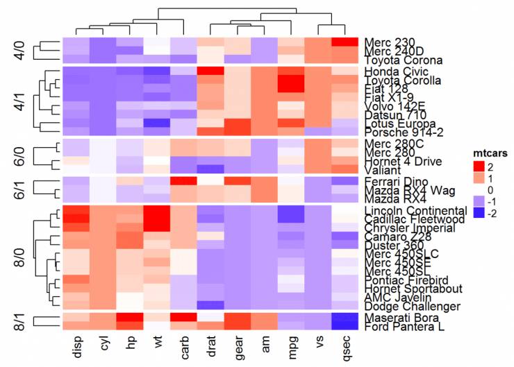
# Combine km and split
Heatmap(df, name ="mtcars", col = mycol, km = 2, split = mtcars$cyl)
#也可以自定义分割
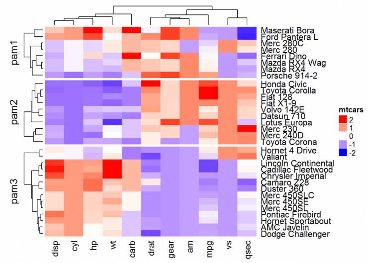
library("cluster")
set.seed(1122)
pa = pam(df, k = 3)Heatmap(df, name = "mtcars", col = mycol, split = paste0("pam",
pa$clustering))
还可以将用户定义的树形图和分割相结合。在这种情况下,split可以指定为单个数字:
row_dend = hclust(dist(df)) # row clusterin
grow_dend = color_branches(row_dend, k = 4)
Heatmap(df, name = "mtcars", col = mycol, cluster_rows = row_dend, split = 2)
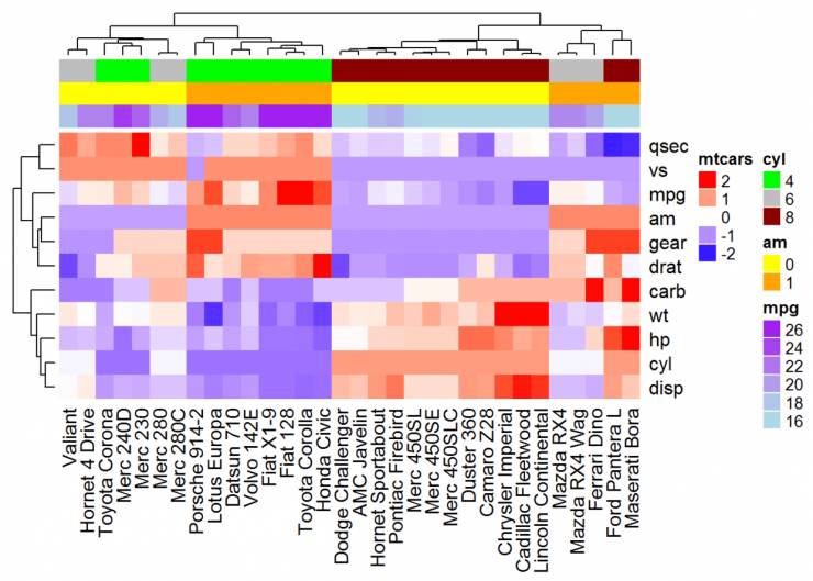
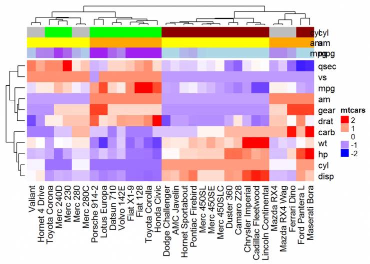
热图注释
利用HeatmapAnnotation()对行或列注释。格式为: HeatmapAnnotation(df, name, col, show_legend)
● df:带有列名的data.frame
● name:热图标注的名称
● col:映射到df中列的颜色列表
# Transposedf <- t(df)
# Heatmap of the transposed data
Heatmap(df, name ="mtcars", col = mycol)
# Annotation data frame
annot_df <- data.frame(cyl = mtcars$cyl, am = mtcars$am, mpg = mtcars$mpg)
# Define colors for each levels of qualitative variables
# Define gradient color for continuous variable (mpg)
col = list(cyl = c("4" = "green", "6" = "gray", "8" = "darkred"), am = c("0" = "yellow",
"1" = "orange"), mpg = colorRamp2(c(17, 25), c("lightblue", "purple")) )
# Create the heatmap annotation
ha <- HeatmapAnnotation(annot_df, col = col)
# Combine the heatmap and the annotation
Heatmap(df, name = "mtcars", col = mycol, top_annotation = ha)
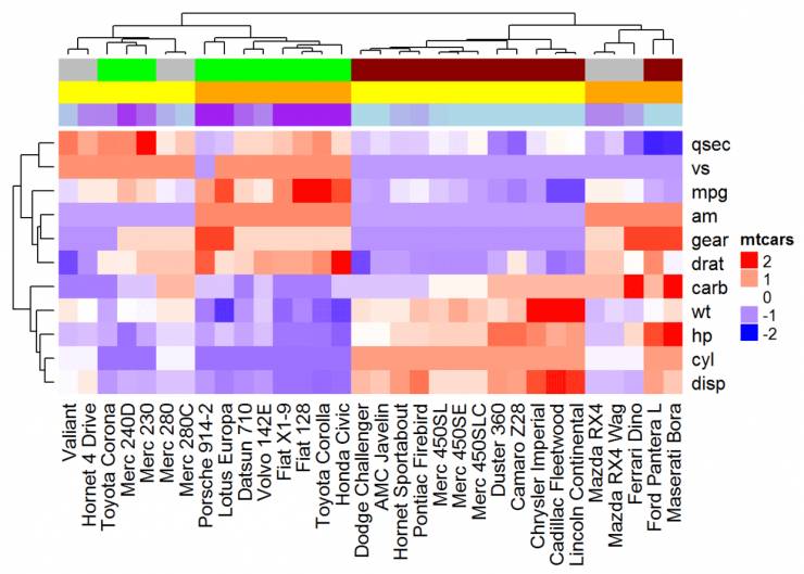
#可以使用参数show_legend = FALSE来隐藏注释图例
ha <- HeatmapAnnotation(annot_df, col = col, show_legend = FALSE)
Heatmap(df, name = "mtcars", col = mycol, top_annotation = ha)
#注释名称可以使用下面的R代码添加
library("GetoptLong")
# Combine Heatmap and annotation
ha <- HeatmapAnnotation(annot_df, col = col, show_legend = FALSE)
Heatmap(df, name = "mtcars", col = mycol, top_annotation = ha)
# Add annotation names on the right
for(an in colnames(annot_df)) {
seekViewport(qq("annotation_@{an}"))
grid.text(an, unit(1, "npc") + unit(2, "mm"), 0.5, default.units = "npc", just = "left")}
#要在左侧添加注释名称,请使用以下代码
# Annotation names on the left
for(an in colnames(annot_df)) { seekViewport(qq("annotation_@{an}")) grid.text(an,
unit(1, "npc") - unit(2, "mm"), 0.5, default.units = "npc", just = "left")}
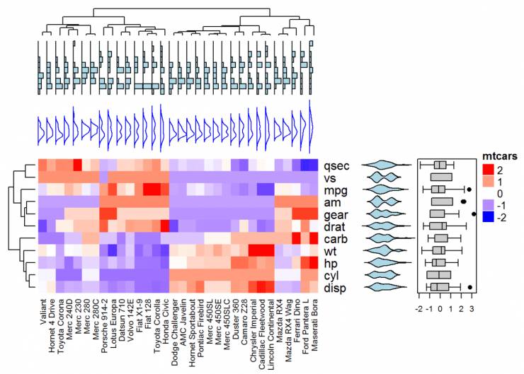
复杂注释
将热图与一些基本图形结合起来进行注释,利用anno_point(),anno_barplot(),anno_boxplot(),anno_density() 和 anno_histogram()。
# Define some graphics to display the distribution of columns
.hist = anno_histogram(df, gp = gpar(fill = "lightblue"))
.density = anno_density(df, type = "line", gp = gpar(col = "blue"))
ha_mix_top = HeatmapAnnotation(hist = .hist, density = .density)
# Define some graphics to display the distribution of rows
.violin = anno_density(df, type = "violin", gp = gpar(fill = "lightblue"), which = "row")
.boxplot = anno_boxplot(df, which = "row")
ha_mix_right = HeatmapAnnotation(violin = .violin, bxplt = .boxplot, which = "row",
width = unit(4, "cm"))
# Combine annotation with heatmap
Heatmap(df, name = "mtcars", col = mycol, column_names_gp = gpar(fontsize = 8),
top_annotation = ha_mix_top, top_annotation_height = unit(4, "cm")) + ha_mix_right
热图组合
# Heatmap 1
ht1 = Heatmap(df, name = "ht1", col = mycol, km = 2, column_names_gp = gpar(fontsize = 9))
# Heatmap 2
ht2 = Heatmap(df, name = "ht2", col = colorRamp2(c(-2, 0, 2), c("green", "white", "red")), column_names_gp = gpar(fontsize = 9))
# Combine the two heatmaps
ht1 + ht2
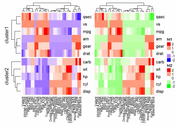
可以使用选项width = unit(3,“cm”))来控制热图大小。注意,当组合多个热图时,第一个热图被视为主热图。剩余热图的一些设置根据主热图的设置自动调整。这些设置包括:删除行集群和标题,以及添加拆分等。
draw(ht1 + ht2,
# Titles
row_title = "Two heatmaps, row title",
row_title_gp = gpar(col = "red"),
column_title = "Two heatmaps, column title",
column_title_side = "bottom",
# Gap between heatmaps
gap = unit(0.5, "cm"))
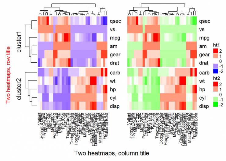
可以使用参数show_heatmap_legend = FALSE,show_annotation_legend = FALSE删除图例。
基因表达矩阵
在基因表达数据中,行代表基因,列是样品值。关于基因的更多信息可以在表达热图之后附加,例如基因长度和基因类型。
expr = readRDS(paste0(system.file(package = "ComplexHeatmap"), "/extdata/gene_expression.rds"))
mat = as.matrix(expr[, grep("cell", colnames(expr))])
type = gsub("sd+_", "", colnames(mat))
ha = HeatmapAnnotation(df = data.frame(type = type))
Heatmap(mat, name = "expression", km = 5, top_annotation = ha, top_annotation_height = unit(4, "mm"),
show_row_names = FALSE, show_column_names = FALSE) +
Heatmap(expr$length, name = "length", width = unit(5, "mm"), col = colorRamp2(c(0, 100000), c("white", "orange"))) +
Heatmap(expr$type, name = "type", width = unit(5, "mm")) +
Heatmap(expr$chr, name = "chr", width = unit(5, "mm"), col = rand_color(length(unique(expr$chr))))
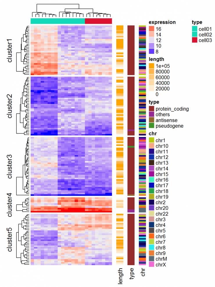
也可以可视化基因组变化和整合不同的分子水平(基因表达,DNA甲基化,…)
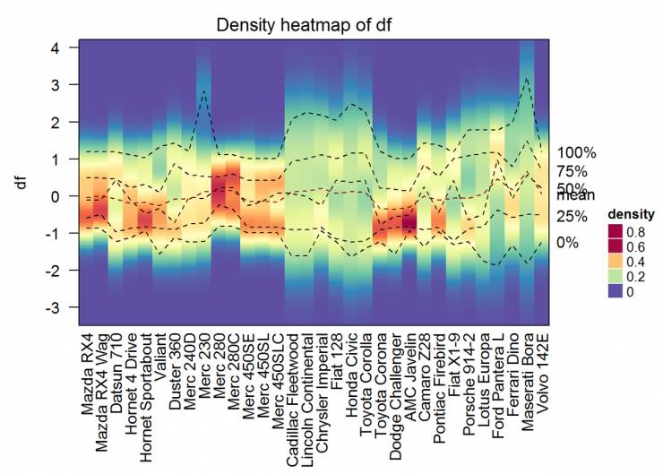
可视化矩阵中列的分布
使用函数densityHeatmap()。
densityHeatmap(df)
- 本文固定链接: https://maimengkong.com/image/1084.html
- 转载请注明: : 萌小白 2022年6月30日 于 卖萌控的博客 发表
- 百度已收录