R语言中可视化包ggplot2可以绘制出优美的可视化图片,但如果要通过ggplot2个性化的绘制一套图形,尤其是适用于杂志期刊等出版物的图形,对于那些没有深入了解ggplot2的科研人员来说就有点困难了,基于ggplot2创建的可视化包ggpubr,用于绘制符合出版物要求的图形。作图方便简单,成图导出就可以用到文章中。

01
安装扩展包
方法一、
install.packages("ggpubr")
方法二、
# 从GitHub上安装最新版本
install.packages("devtools")
library(devtools)
install_github("kassambara/ggpubr")
02
加载扩展包
library(ggpubr)
整个安装过程非常方便简单。
03
加载demo数据
# 加载数据一
data("mtcars")
df <- mtcars
# 重点介绍数据中的四个属性
#wt:重量
#mpg:汽车的油耗
#cyl:汽车的气缸数
#qsec:加速时间
# 加载数据二
data(“iris”)
#Sepal.Length Sepal.Width Petal.LengthPetal.Width Species
#花萼长度 花萼宽度 花瓣长度 花瓣宽度 属种
04
绘制适用于杂志期刊的多样化图
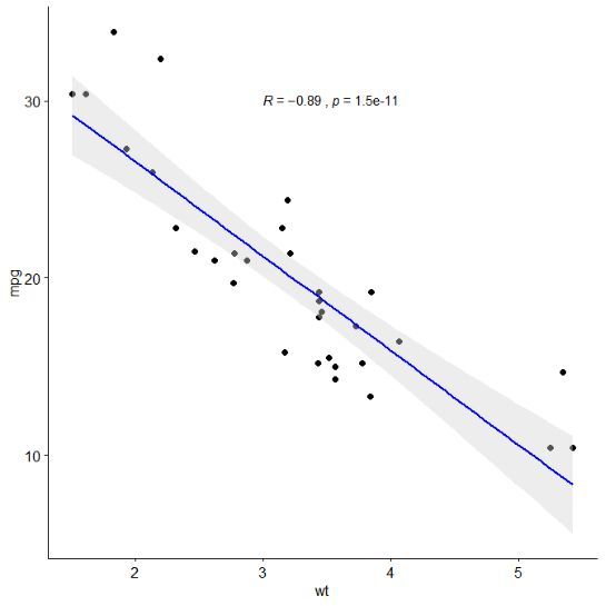
1)、绘制wt和mpg的散点图,并在图中添加线性回归的线,添加置信区间,添加斯皮尔曼相关性系数,斯皮尔曼的检验p值。
ggscatter(df, x = "wt", y = "mpg",
add = "reg.line", # Add regression line
conf.int = TRUE, # Add confidence interval
add.params = list(color = "blue",ill = "lightgray"))
+stat_cor(method = "spearman", label.x = 3, label.y = 30)
# stat_cor:Add correlation coefficient
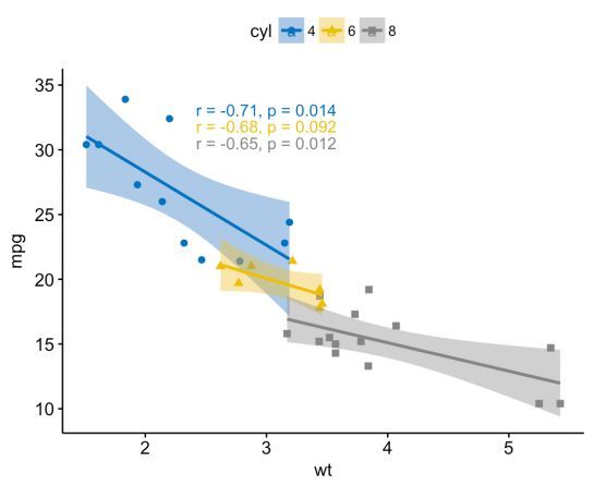
2)、按照汽车的气缸数分组添加线性回归线,添加置信区间,按照汽车的汽缸属分组,用不同颜色和点的形状进行区分。
df$cyl = as.factor(df$cyl) #更改数据类型
ggscatter(df, x = "wt", y = "mpg",
add = "reg.line", # Add regression line
conf.int = TRUE, # Add confidence interval
color = "cyl", palette = "jco",
# Color by groups "cyl"
shape = "cyl"
# Change point shape by groups "cyl"
) + stat_cor(method = "spearman", aes(color = cyl), label.x = 3)
# stat_cor:Add correlation coefficient
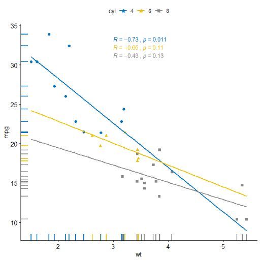
3)、按照汽车的气缸数分组添加线性回归线,用不同颜色和点的形状进行区分,在x,y轴上添加边际密度分布情况。
ggscatter(df, x = "wt", y = "mpg", add = "reg.line",
# Add regression line color = "cyl"
palette = "jco", # Color by groups "cyl"
shape = "cyl",
# Change point shape by groups "cyl"
fullrange = TRUE,
# Extending the regression line
rug = TRUE # Add marginal rug
)+ stat_cor(aes(color = cyl), label.x = 3)
# stat_cor:Add correlation coefficient
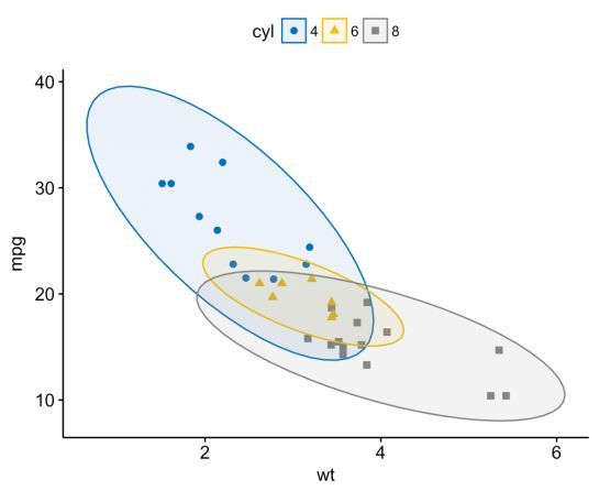
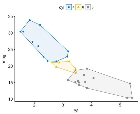
4)、按照汽车的汽缸分成不同的组,并在不同的分组加上置信的圈图
ggscatter(df, x = "wt", y = "mpg", color = "cyl",
palette = "jco", shape = "cyl", ellipse = TRUE)
5)、按照汽车的汽缸分成不同的组,并在不同的分组上添加置信的多边形图
ggscatter(df, x = "wt", y = "mpg", color ="cyl", palette = "jco",
shape = "cyl", ellipse = TRUE, ellipse.type = "convex")
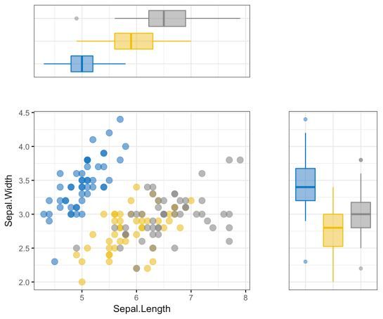
6)、按照花的种类进行分组,在x,y轴的边界上添加密度分布
sp <- ggscatter(iris, x = "Sepal.Length", y = "Sepal.Width",
color = "Species", palette = "jco", size = 3, alpha = 0.6)+
border()
# Marginal density plot of x (top panel) and y (right panel)
xplot <- ggdensity(iris, "Sepal.Length", fill = "Species", palette = "jco")
yplot <- ggdensity(iris, "Sepal.Width", fill = "Species", palette = "jco")+
rotate()
# Cleaning the plots
sp <- sp + rremove("legend")
yplot <- yplot + clean_theme() + rremove("legend")
xplot <- xplot + clean_theme() + rremove("legend")
# Arranging the plot using cowplot
library(cowplot)
plot_grid(xplot, NULL, sp, yplot, ncol = 2,, rel_widths = c(2, 1),
rel_heights = c(1, 2))

7)、按照花的种类进行分组,在x,y轴的边界上添加boxplot图
sp <- ggscatter(iris, x = "Sepal.Length", y = "Sepal.Width", color = "Species",
palette = "jco", size = 3, alpha = 0.6,
ggtheme = theme_bw())
# Marginal boxplot of x (top panel) and y (right panel)
xplot <- ggboxplot(iris, x = "Species", y = "Sepal.Length", color = "Species",
fill = "Species", palette = "jco", alpha = 0.5, ggtheme = theme_bw())+
rotate()
yplot <- ggboxplot(iris, x = "Species", y = "Sepal.Width", color = "Species",
fill = "Species", palette = "jco", alpha = 0.5,
ggtheme = theme_bw())
# Cleaning the plots
sp <- sp + rremove("legend")
yplot <- yplot + clean_theme() + rremove("legend")
xplot <- xplot + clean_theme() + rremove("legend")
# Arranging the plot using cowplot
library(cowplot)
plot_grid(xplot, NULL, sp, yplot, ncol = 2,,
rel_widths = c(2, 1), rel_heights = c(1, 2))
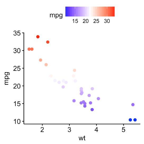
8)、在汽车重量和汽车油耗的散点图上绘制出油耗的热图
p <- ggscatter(df, x = "wt", y = "mpg", color = "mpg")
p + gradient_color(c("blue", "white", "red"))
# Change gradient color
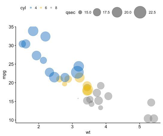
9)、在汽车重量和汽车油耗的散点图上绘制出加速时间的气泡图
ggscatter(df, x = "wt", y = "mpg", color = "cyl", palette = "jco", size = "qsec",
alpha = 0.5)+ scale_size(range = c(0.5, 15))
# scale_size:Adjust the range of points size
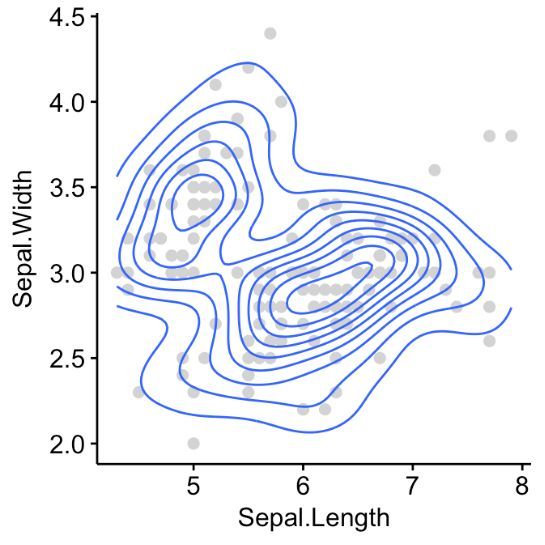
10)、在花萼的长度、花萼宽度的散点图中添加密度等高线
sp <- ggscatter(iris, x = "Sepal.Length", y = "Sepal.Width", color = "lightgray")
sp + geom_density_2d() # Gradient color
sp + stat_density_2d(aes(fill = ..level..), geom = "polygon")
# Change gradient color: custom
sp + stat_density_2d(aes(fill = ..level..), geom = "polygon")+
gradient_fill(c("white", "steelblue"))
# Change the gradient color
sp + stat_density_2d(aes(fill = ..level..),
geom = "polygon") + gradient_fill("YlOrRd")
# RColorBrewer palette
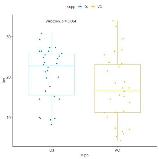
11)、在boxplot图中添加两组的p-values
data("ToothGrowth")
p <- ggboxplot(ToothGrowth, x = "supp", y = "len", color = "supp", palette = "jco",
add = "jitter")
p + stat_compare_means(method = " wilcox.test")
# stat_compare_mean():自动添加p-value、显著性标记到ggplot图中
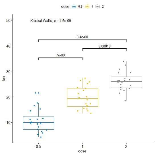
12)、在boxplot图中添加多组的p-values
compare_means(len ~ dose, data = ToothGrowth)
## # A tibble: 3 x 8
## .y. group1 group2 p p.adj p.format p.signif method
##
## 1 len 0.5 1 7.02e-06 1.40e-05 7.0e-06 **** Wilcoxon
## 2 len 0.5 2 8.41e-08 2.52e-07 8.4e-08 **** Wilcoxon
## 3 len 1 2 1.77e-04 1.77e-04 0.00018 *** Wilcoxon
# Visualize: Specify the comparisons you want
my_comparisons <- list( c("0.5", "1"), c("1", "2"), c("0.5", "2") )
ggboxplot(ToothGrowth, x = "dose", y = "len",
color = "dose", palette = "jco",add = "jitter")+
stat_compare_means(comparisons = my_comparisons)+
# Add pairwise comparisons p-value
stat_compare_means(label.y = 50)
# Add global p-value
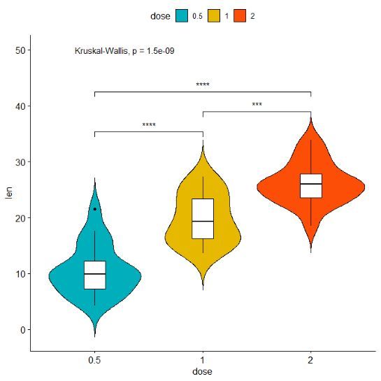
13)、在小提琴图中添加p值
ggviolin(ToothGrowth, x = "dose", y = "len", fill = "dose",
palette = c("#00AFBB", "#E7B800", "#FC4E07"), add = "boxplot",
add.params = list(fill = "white"))+
stat_compare_means(comparisons = my_comparisons, label = "p.signif")+
# Add significance levels
stat_compare_means(label.y = 50)
# Add global the p-value
引用网址:
https://www.r-bloggers.com/ggpubr-create-easily-publication-ready-plots/
供稿:黄云
编辑:王霞
转自:锐翌基因
- 本文固定链接: https://maimengkong.com/image/1072.html
- 转载请注明: : 萌小白 2022年6月29日 于 卖萌控的博客 发表
- 百度已收录