R语言基本绘图函数中可以利用par()以及layout()来进行图形排列,但是这两个函数对于ggplot图则不太适用,本文主要讲解如何对多ggplot图形多页面进行排列。主要讲解如何利用包gridExtra、cowplot以及ggpubr中的函数进行图形排列。
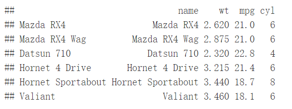
绘制图形 #load packages library(gridExtra) library(cowplot) library(ggpubr) #dataset ToothGrowth and mtcars mtcars$name <- rownames(mtcars) mtcars$cyl <- as.factor(mtcars$cyl) head(mtcars[, c("name", "wt","mpg", "cyl")])
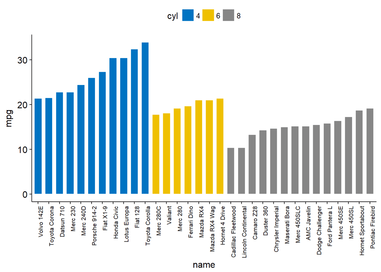
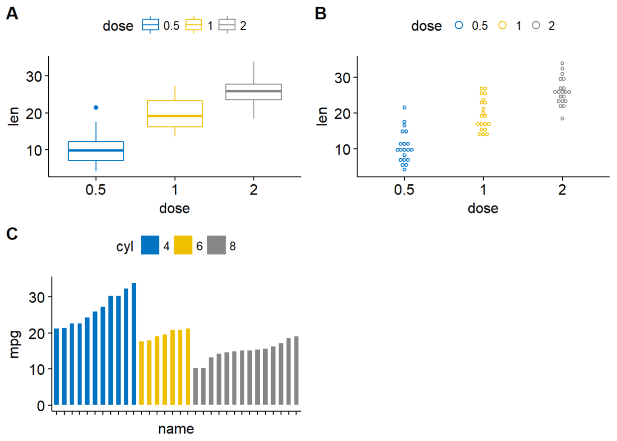
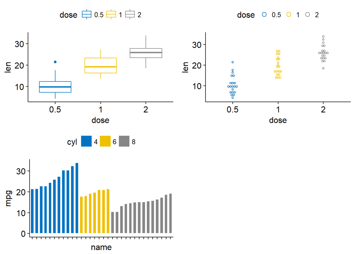
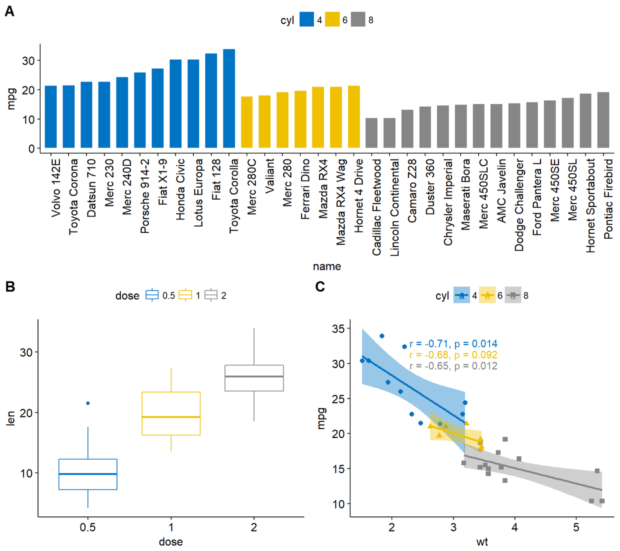
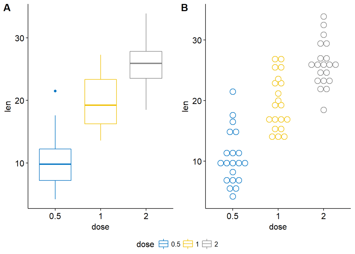
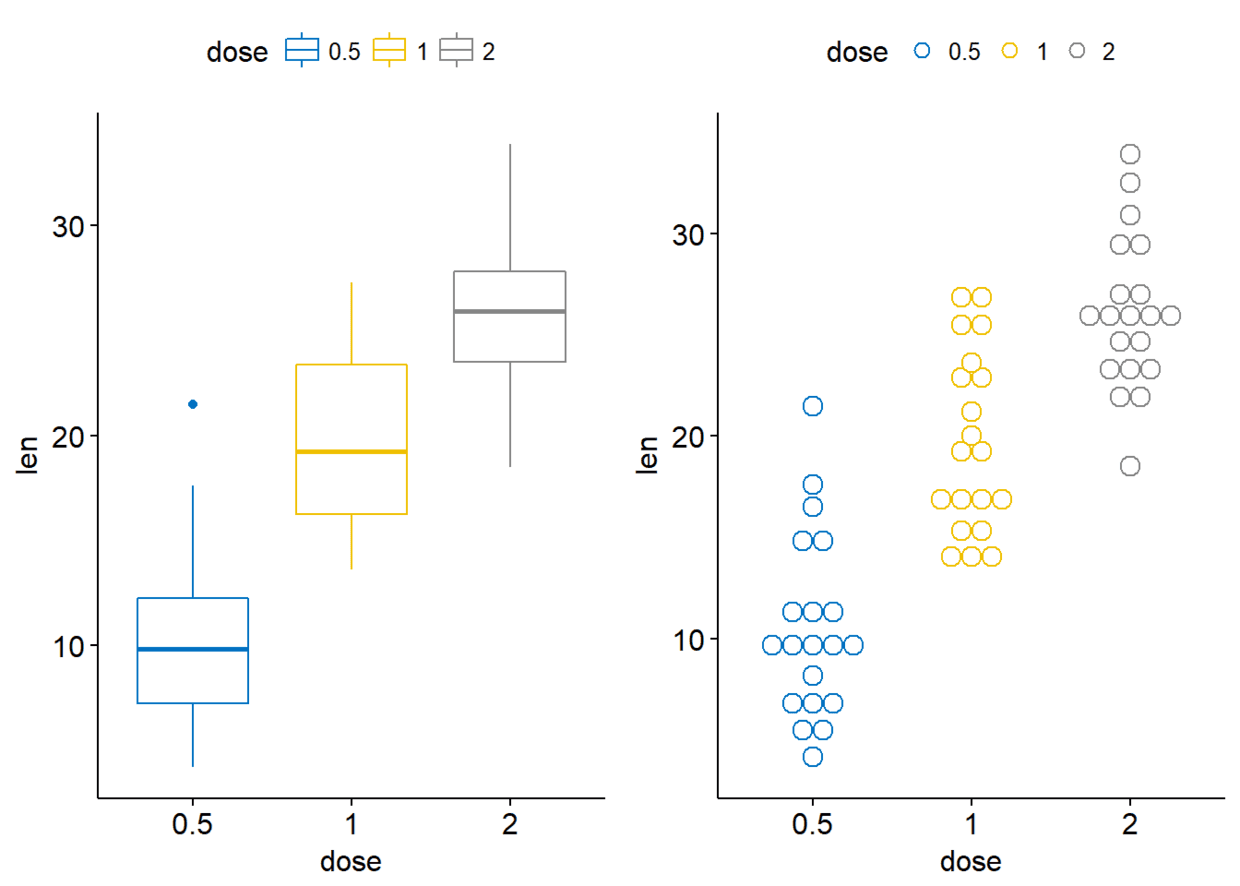
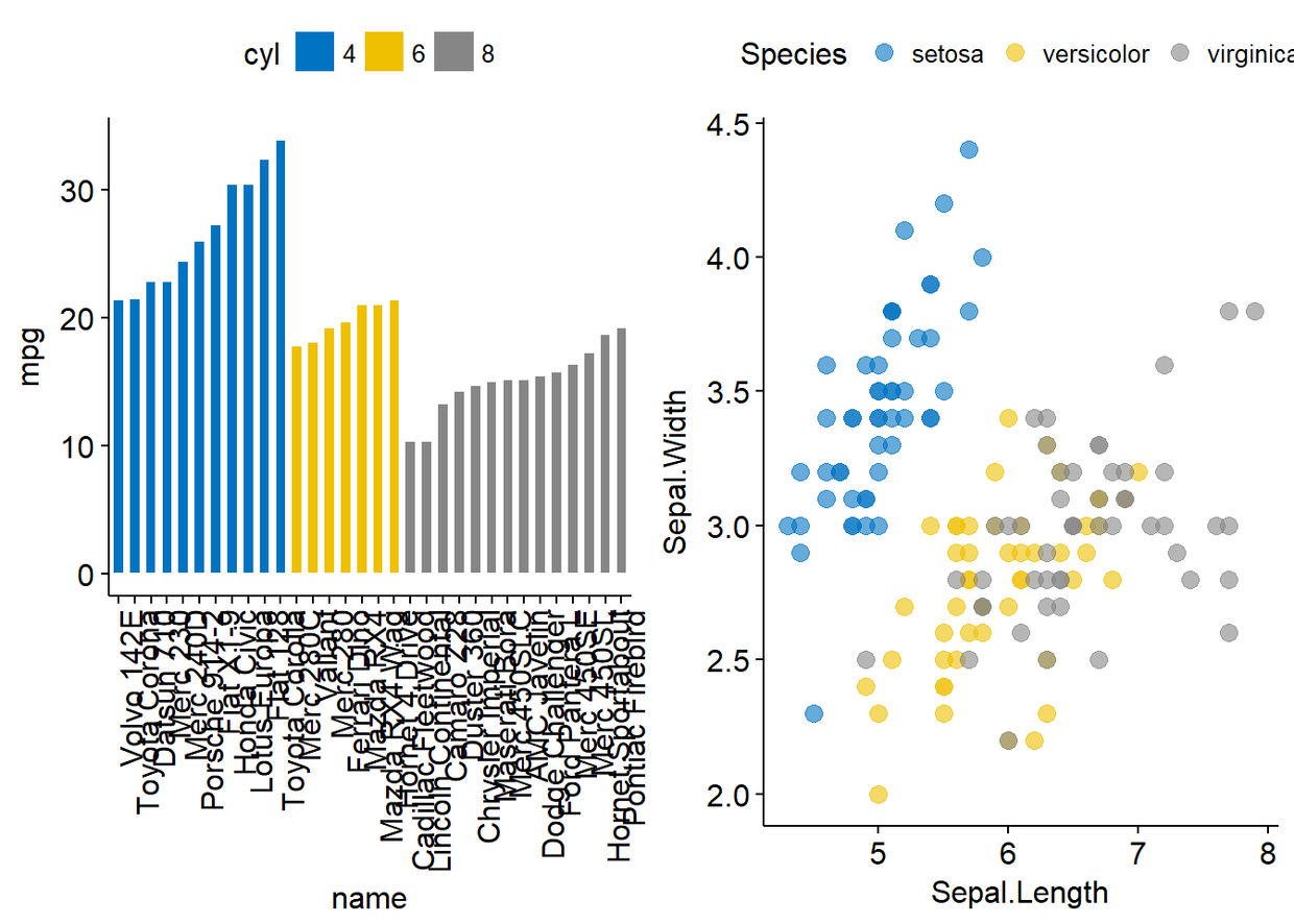
#First let's create some plots #Box plot(bxp) bxp <- ggboxplot(ToothGrowth, x="dose", y="len", color = "dose", palette = "jco") #Dot plot(dp) dp <- ggdotplot(ToothGrowth, x="dose", y="len", color = "dose", palette = "jco", binwidth = 1) #An ordered Bar plot(bp) bp <- ggbarplot(mtcars, x="name", y="mpg", fill="cyl", #change fill color by cyl color="white", #Set bar border colors to white palette = "jco", #jco jourbal color palette sort.val = "asc", #Sort the value in ascending order sort.by.groups = TRUE, #Sort inside each group x.text.angle=90 #Rotate vertically x axis texts ) bp+font("x.text", size = 8)
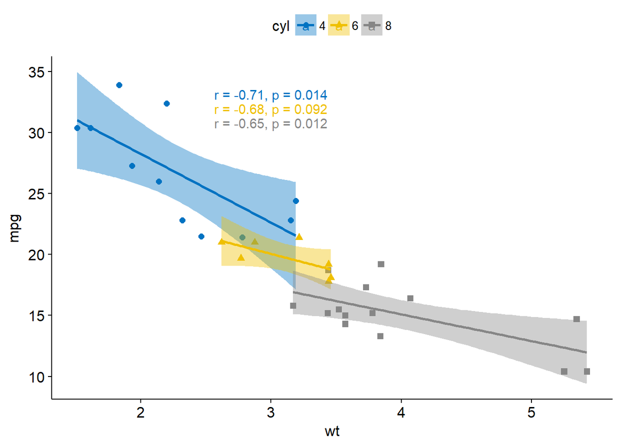
#Scatter plots(sp) sp <- ggscatter(mtcars, x="wt", y="mpg", add = "reg.line", #Add regression line conf.int = TRUE, #Add confidence interval color = "cyl", palette = "jco",#Color by group cyl shape = "cyl" #Change point shape by groups cyl )+ stat_cor(aes(color=cyl), label.x = 3) #Add correlation coefficientsp
图形排列
多幅图形排列于一面
- ggpubr::ggarrange()
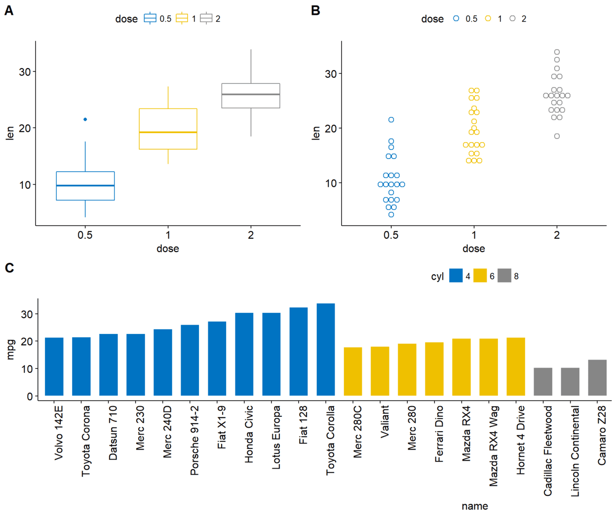
ggarrange(bxp, dp, bp+rremove("x.text"), labels = c("A", "B", "C"), ncol = 2, nrow = 2)
- cowplot::plot.grid()
plot_grid(bxp, dp, bp+rremove("x.text"), labels = c("A", "B", "C"), ncol = 2, nrow = 2)
- gridExtra::grid.arrange()
grid.arrange(bxp, dp, bp+rremove("x.text"), ncol=2, nrow=2)
排列图形注释
- ggpubr::annotate_figure()
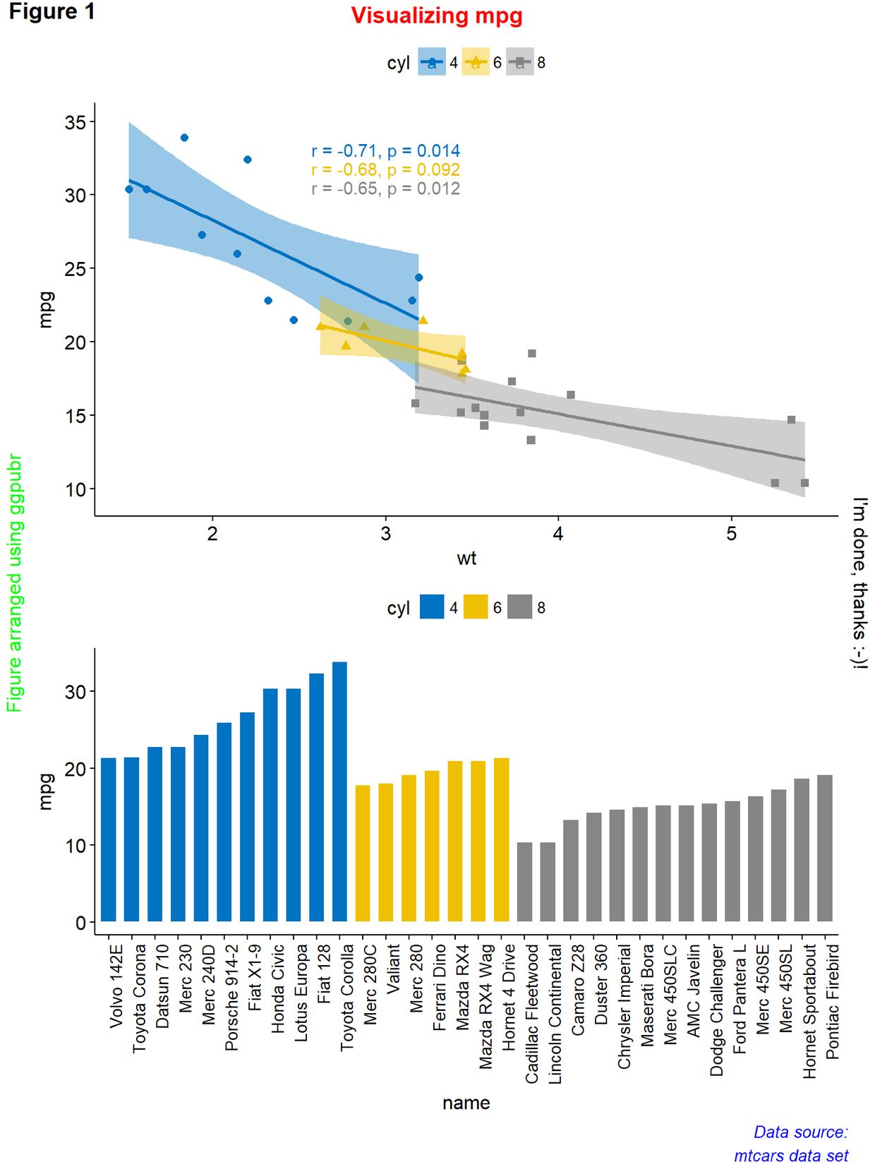
figure <- ggarrange(sp, bp+font("x.text", size = 10), ncol = 1, nrow = 2) annotate_figure(figure, top=text_grob("Visualizing mpg", color = "red", face = "bold", size=14), bottom = text_grob("Data source:\n mtcars data set", color = "blue", hjust = 1, x=1, face = "italic", size=10), left = text_grob("Figure arranged using ggpubr", color = "green", rot = 90), right = "I'm done, thanks :-)!", fig.lab = "Figure 1", fig.lab.face = "bold")
绘图面板对齐
- 绘制生存曲线
R语言基本绘图函数中可以利用par()以及layout()来进行图形排列,但是这两个函数对于ggplot图则不太适用,本文主要讲解如何对多ggplot图形多页面进行排列。主要讲解如何利用包gridExtra、cowplot以及ggpubr中的函数进行图形排列。
绘制图形 #load packages library(gridExtra) library(cowplot) library(ggpubr) #dataset ToothGrowth and mtcars mtcars$name <- rownames(mtcars) mtcars$cyl <- as.factor(mtcars$cyl) head(mtcars[, c("name", "wt","mpg", "cyl")])
#First let's create some plots #Box plot(bxp) bxp <- ggboxplot(ToothGrowth, x="dose", y="len", color = "dose", palette = "jco") #Dot plot(dp) dp <- ggdotplot(ToothGrowth, x="dose", y="len", color = "dose", palette = "jco", binwidth = 1) #An ordered Bar plot(bp) bp <- ggbarplot(mtcars, x="name", y="mpg", fill="cyl", #change fill color by cyl color="white", #Set bar border colors to white palette = "jco", #jco jourbal color palette sort.val = "asc", #Sort the value in ascending order sort.by.groups = TRUE, #Sort inside each group x.text.angle=90 #Rotate vertically x axis texts ) bp+font("x.text", size = 8)
#Scatter plots(sp) sp <- ggscatter(mtcars, x="wt", y="mpg", add = "reg.line", #Add regression line conf.int = TRUE, #Add confidence interval color = "cyl", palette = "jco",#Color by group cyl shape = "cyl" #Change point shape by groups cyl )+ stat_cor(aes(color=cyl), label.x = 3) #Add correlation coefficientsp
图形排列
多幅图形排列于一面
- ggpubr::ggarrange()
ggarrange(bxp, dp, bp+rremove("x.text"), labels = c("A", "B", "C"), ncol = 2, nrow = 2)
- cowplot::plot.grid()
plot_grid(bxp, dp, bp+rremove("x.text"), labels = c("A", "B", "C"), ncol = 2, nrow = 2)
- gridExtra::grid.arrange()
grid.arrange(bxp, dp, bp+rremove("x.text"), ncol=2, nrow=2)
排列图形注释
- ggpubr::annotate_figure()
figure <- ggarrange(sp, bp+font("x.text", size = 10), ncol = 1, nrow = 2) annotate_figure(figure, top=text_grob("Visualizing mpg", color = "red", face = "bold", size=14), bottom = text_grob("Data source:\n mtcars data set", color = "blue", hjust = 1, x=1, face = "italic", size=10), left = text_grob("Figure arranged using ggpubr", color = "green", rot = 90), right = "I'm done, thanks :-)!", fig.lab = "Figure 1", fig.lab.face = "bold")
绘图面板对齐
- 绘制生存曲线
R包cowplot
cowplot::ggdraw()可以将图形置于特定位置, ggdraw()首先会初始化一个绘图面板, 接下来draw_plot()则是将图形绘制于初始化的绘图面板中,通过参数设置可以将图形置于特定位置。
draw_plot(plot, x=0, y=0, width=1, height=1)
其中:
- plot:将要放置的图形
- x,y:控制图形位置
- width,height:图形的宽度和高度
- draw_plot_label():为图形添加标签
draw_plot_label(label, x=0, y=1, size=16, ...)
其中:
- label:标签
- x,y:控制标签位置
- size:标签字体大小
下面通过一个例子来讲解如何将多个图形放置在特定的位置。
ggdraw()+ draw_plot(bxp, x=0, y=0.5, width=0.5, height = 0.5)+ draw_plot(dp, x=0.5, y=0.5, width = 0.5, height = 0.5)+ draw_plot(bp, x=0, y=0, width = 1.5, height = 0.5)+ draw_plot_label(label = c("A", "B", "C"), size = 15, x=c(0, 0.5, 0), y=c(1, 1, 0.5))
R包gridExtra
gridExtra::arrangeGrop()改变行列分布
下面将sp置于第一行并横跨两列,而bxp和dp分别分布于第二行两列
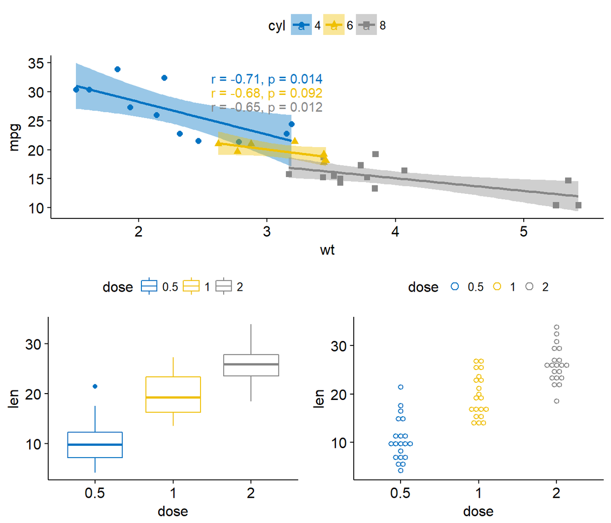
grid.arrange(sp, #First row with one plot spaning over 2 columns arrangeGrob(bxp, dp, ncol = 2), #Second row with 2plots in 2 different columns nrow=2) #number of rows
也可以通过函数grid.arrange中的layout_matrix来设置复杂的图形布局
grid.arrange(bp, #bar plot spaning two columns bxp, sp, #box plot amd scatter plot ncol=2, nrow=2, layout_matrix=rbind(c(1, 1), c(2, 3)))

要相对grid.arrange()以及arrangeGrob()的输出进行注释,首先要利用as_ggplot()将其转化为ggplot图形,进而利用函数draw_plot_label()对其进行注释。
gt <- arrangeGrob(bp, bxp, sp, layout_matrix = rbind(c(1,1),c(2, 3))) p <- as_ggplot(gt)+ draw_plot_label(label = c("A", "B", "C"), size = 15, x=c(0, 0, 0.5), y=c(1, 0.5, 0.5)) p
R包grid
R包grid中的grid.layout()可以设置复杂的图形布局,viewport()可以定义一个区域用来安置图形排列,print()则用来将图形置于特定区域。 总结起来步骤如下:
- 创建图形p1,p2,p3,…
- grid.newpage()创建一个画布
- 创建图形布局,几行几列
- 定义布局的矩形区域
- print:将图形置于特定区域
library(grid) #Move to a new page grid.newpage() #Create layout:nrow=3, ncol=2 pushViewport(viewport(layout = grid.layout(nrow=3, ncol=2))) #A helper function to define a region on the layout define_region <- function(row, col){ viewport(layout.pos.row = row, layout.pos.col = col)} #Arrange the plots print(sp, vp=define_region(row=1, col=1:2)) #Span over two columns print(bxp, vp=define_region(row=2, col=1)) print(dp, vp=define_region(row=2, col=2)) print(bp+rremove("x.text"), vp=define_region(row=3, col=1:2)) 设置共同图例
ggpubr::ggarrange()可以为组合图形添加共同图例
- common.legeng=TRUE:在图形旁边添加图例
- legend:指定legend的位置,主要选项有:top、bottom、left、right。
ggarrange(bxp, dp, labels = c("A", "B"), common.legend = TRUE, legend = "bottom")
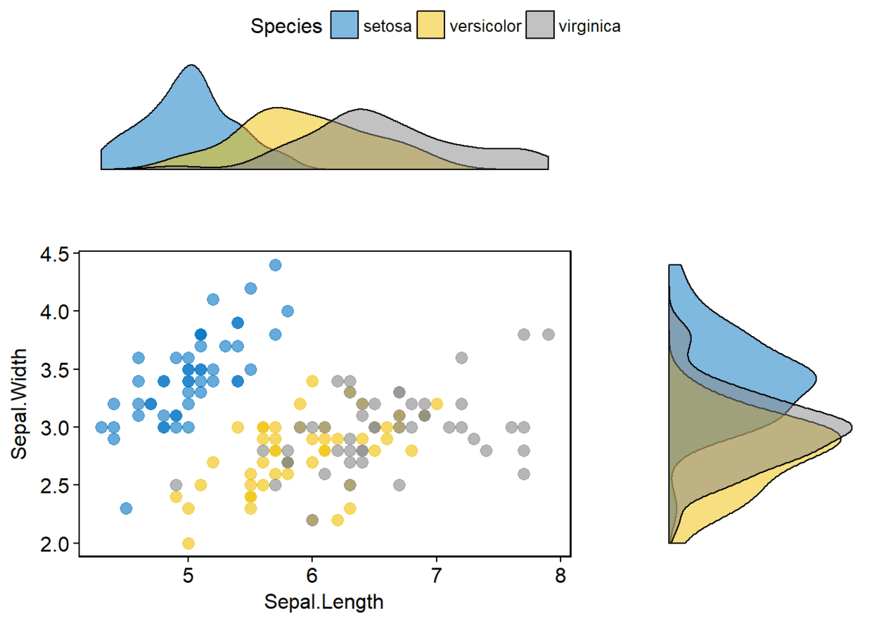
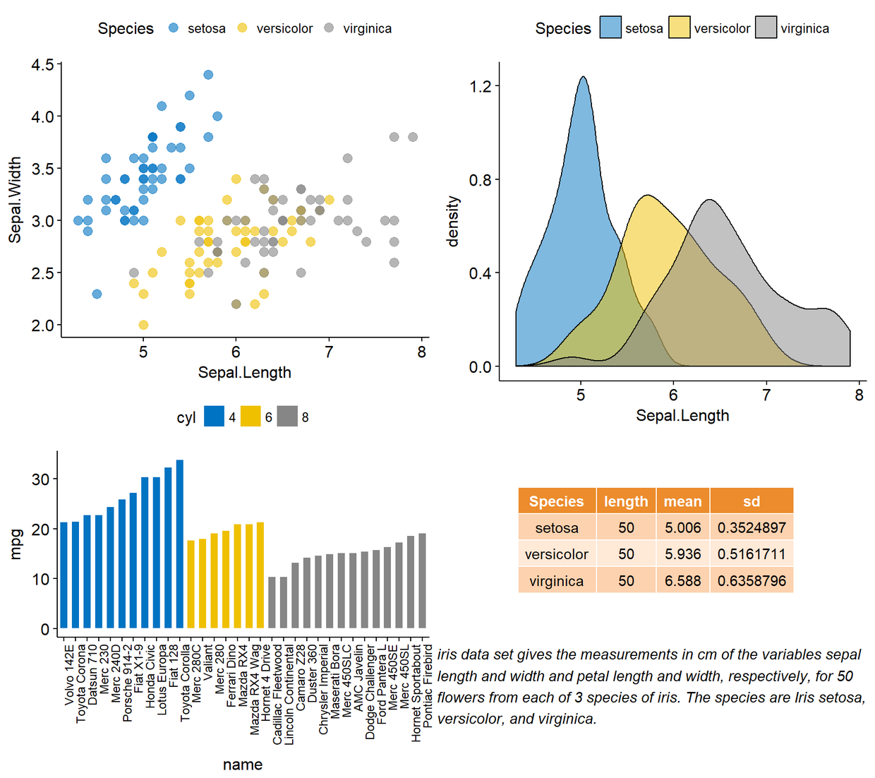
含有边际密度图的散点图 sp <- ggscatter(iris, x="Sepal.Length", y="Sepal.Width", color="Species", palette = "jco", size=3, alpha=0.6)+border() #Marginal density plot of x(top panel) and y(right panel) xplot <- ggdensity(iris, "Sepal.Length", fill="Species",palette = "jco") yplot <- ggdensity(iris, "Sepal.Width", fill="Species", palette = "jco")+rotate() #Clean the plots xplot <- xplot+clean_theme() yplot <- yplot+clean_theme() #Arrange the plots ggarrange(xplot, NULL, sp, yplot, ncol = 2, nrow = 2, align = "hv", widths = c(2, 1), heights = c(1, 2), common.legend = TRUE)
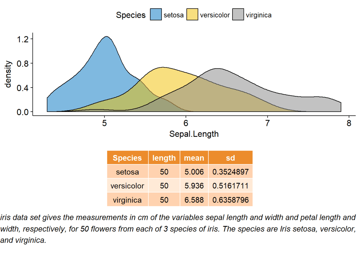
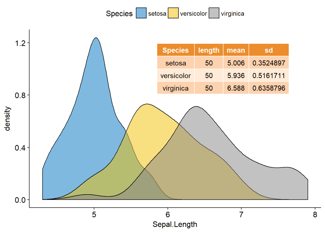
ggplot图、文本、表格组合 density.p <- ggdensity(iris, x="Sepal.Length", fill="Species", palette = "jco") #Compute the summary table of Sepal.Length stable <- desc_statby(iris, measure.var = "Sepal.Length", grps = "Species") stable <- stable[, c("Species", "length", "mean", "sd")] #Summary table plot, medium and theme stable.p <- ggtexttable(stable, rows = NULL, theme = ttheme("mOrange")) text <- paste("iris data set gives the measurements in cm", "of the variables sepal length and width", "and petal length and width, respectively,", "for 50 flowers from each of 3 species of iris.", "The species are Iris setosa, versicolor, and virginica.", sep = " ") text.p <- ggparagraph(text = text, face = "italic", size = 11, color = "black") #Arrange the plots on the same page ggarrange(density.p, stable.p, text.p, ncol = 1, nrow = 3, heights = c(1, 0.5, 0.3))
ggplot图形中嵌入图形元素
ggplot2::annotation_custom()可以添加各种图形元素到ggplot图中
annotation_custom(grob, xmin, xmax, ymin, ymax)
其中:
- grob:要添加的图形元素
- xmin, xmax: x轴方向位置(水平方向)
- ymin, ymax: y轴方向位置(竖直方向)
ggplot图形中添加table density.p+annotation_custom(ggplotGrob(stable.p), xmin = 5.5, xmax = 8, ymin = 0.7)
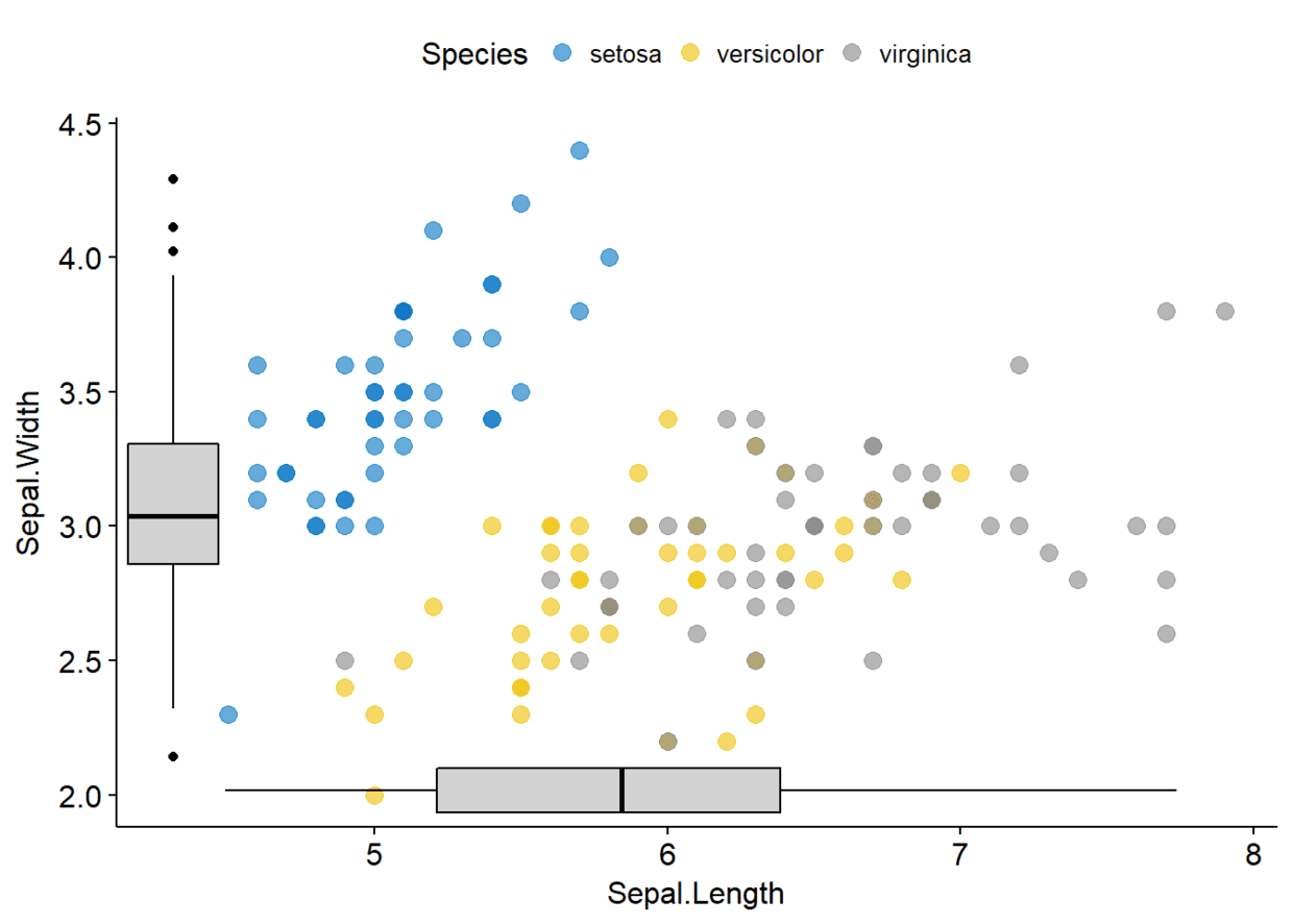
ggplot图形中添加box plot sp <- ggscatter(iris, x="Sepal.Length", y="Sepal.Width", color = "Species", palette = "jco", size = 3, alpha=0.6) xbp <- ggboxplot(iris$Sepal.Length, width = 0.3, fill = "lightgray")+ rotate()+theme_transparent() ybp <- ggboxplot(iris$Sepal.Width, width = 0.3, fill="lightgray")+theme_transparent() # Create the external graphical objects # called a "grop" in Grid terminology xbp_grob <- ggplotGrob(xbp) ybp_grob <- ggplotGrob(ybp) #place box plots inside the scatter plot xmin <- min(iris$Sepal.Length) xmax <- max(iris$Sepal.Length) ymin <- min(iris$Sepal.Width) ymax <- max(iris$Sepal.Width) yoffset <- (1/15)*ymax xoffset <- (1/15)*xmax # Insert xbp_grob inside the scatter plots p+annotation_custom(grob = xbp_grob, xmin = xmin, xmax = xmax, ymin = ymin-yoffset, ymax = ymin+yoffset)+ # Insert ybp_grob inside the scatter plot annotation_custom(grob = ybp_grob, xmin = xmin-xoffset, xmax=xmin+xoffset, ymin=ymin, ymax=ymax)
ggplot图形添加背景 #import the imageimg.file <- system.file(file.path("images", "background-image.png"), package = "ggpubr") img <- png::readPNG(img.file)
利用ggpubr::background_image()为ggplot图形添加背景图
library(ggplot2) library(ggpubr) ggplot(iris, aes(Species,Sepal.Length))+ background_image(img)+ geom_boxplot(aes(fill=Species), color="white")+ fill_palette("jco")
修改透明度 ggplot(iris, aes(Species,Sepal.Length))+ background_image(img)+geom_boxplot(aes(fill=Species), color="white", alpha=0.5)+ fill_palette("jco")

多页排列
日常工作中我们有时要绘制许多图,假如我们有16幅图,每页排列4张的话就需要4页才能排完,而ggpubr::ggarrange()可以通过制定行列数自动在多页之间进行图形排列
multi.page <-ggarrange(bxp, dp, bp, sp, nrow = 1, ncol = 2)
上述代码返回两页每页两图
multi.page[[1]]
multi.page[[2]]
利用ggarrange()嵌套布局 p1 <- ggarrange(sp, bp+font("x.text", size = 9), ncol = 1, nrow = 2) p2 <- ggarrange(density.p, stable.p, text.p, ncol = 1, nrow = 3, heights = c(1, 0.5, 0.3)) ggarrange(p1, p2, ncol = 2, nrow = 1)
R包cowplot
cowplot::ggdraw()可以将图形置于特定位置, ggdraw()首先会初始化一个绘图面板, 接下来draw_plot()则是将图形绘制于初始化的绘图面板中,通过参数设置可以将图形置于特定位置。
draw_plot(plot, x=0, y=0, width=1, height=1)
其中:
- plot:将要放置的图形
- x,y:控制图形位置
- width,height:图形的宽度和高度
- draw_plot_label():为图形添加标签
draw_plot_label(label, x=0, y=1, size=16, ...)
其中:
- label:标签
- x,y:控制标签位置
- size:标签字体大小
下面通过一个例子来讲解如何将多个图形放置在特定的位置。
ggdraw()+ draw_plot(bxp, x=0, y=0.5, width=0.5, height = 0.5)+ draw_plot(dp, x=0.5, y=0.5, width = 0.5, height = 0.5)+ draw_plot(bp, x=0, y=0, width = 1.5, height = 0.5)+ draw_plot_label(label = c("A", "B", "C"), size = 15, x=c(0, 0.5, 0), y=c(1, 1, 0.5))
R包gridExtra
gridExtra::arrangeGrop()改变行列分布
下面将sp置于第一行并横跨两列,而bxp和dp分别分布于第二行两列
grid.arrange(sp, #First row with one plot spaning over 2 columns arrangeGrob(bxp, dp, ncol = 2), #Second row with 2plots in 2 different columns nrow=2) #number of rows
也可以通过函数grid.arrange中的layout_matrix来设置复杂的图形布局
grid.arrange(bp, #bar plot spaning two columns bxp, sp, #box plot amd scatter plot ncol=2, nrow=2, layout_matrix=rbind(c(1, 1), c(2, 3)))
要相对grid.arrange()以及arrangeGrob()的输出进行注释,首先要利用as_ggplot()将其转化为ggplot图形,进而利用函数draw_plot_label()对其进行注释。
gt <- arrangeGrob(bp, bxp, sp, layout_matrix = rbind(c(1,1),c(2, 3))) p <- as_ggplot(gt)+ draw_plot_label(label = c("A", "B", "C"), size = 15, x=c(0, 0, 0.5), y=c(1, 0.5, 0.5)) p
R包grid
R包grid中的grid.layout()可以设置复杂的图形布局,viewport()可以定义一个区域用来安置图形排列,print()则用来将图形置于特定区域。 总结起来步骤如下:
- 创建图形p1,p2,p3,…
- grid.newpage()创建一个画布
- 创建图形布局,几行几列
- 定义布局的矩形区域
- print:将图形置于特定区域
library(grid) #Move to a new page grid.newpage() #Create layout:nrow=3, ncol=2 pushViewport(viewport(layout = grid.layout(nrow=3, ncol=2))) #A helper function to define a region on the layout define_region <- function(row, col){ viewport(layout.pos.row = row, layout.pos.col = col)} #Arrange the plots print(sp, vp=define_region(row=1, col=1:2)) #Span over two columns print(bxp, vp=define_region(row=2, col=1)) print(dp, vp=define_region(row=2, col=2)) print(bp+rremove("x.text"), vp=define_region(row=3, col=1:2)) 设置共同图例
ggpubr::ggarrange()可以为组合图形添加共同图例
- common.legeng=TRUE:在图形旁边添加图例
- legend:指定legend的位置,主要选项有:top、bottom、left、right。
ggarrange(bxp, dp, labels = c("A", "B"), common.legend = TRUE, legend = "bottom")
含有边际密度图的散点图 sp <- ggscatter(iris, x="Sepal.Length", y="Sepal.Width", color="Species", palette = "jco", size=3, alpha=0.6)+border() #Marginal density plot of x(top panel) and y(right panel) xplot <- ggdensity(iris, "Sepal.Length", fill="Species",palette = "jco") yplot <- ggdensity(iris, "Sepal.Width", fill="Species", palette = "jco")+rotate() #Clean the plots xplot <- xplot+clean_theme() yplot <- yplot+clean_theme() #Arrange the plots ggarrange(xplot, NULL, sp, yplot, ncol = 2, nrow = 2, align = "hv", widths = c(2, 1), heights = c(1, 2), common.legend = TRUE)
ggplot图、文本、表格组合 density.p <- ggdensity(iris, x="Sepal.Length", fill="Species", palette = "jco") #Compute the summary table of Sepal.Length stable <- desc_statby(iris, measure.var = "Sepal.Length", grps = "Species") stable <- stable[, c("Species", "length", "mean", "sd")] #Summary table plot, medium and theme stable.p <- ggtexttable(stable, rows = NULL, theme = ttheme("mOrange")) text <- paste("iris data set gives the measurements in cm", "of the variables sepal length and width", "and petal length and width, respectively,", "for 50 flowers from each of 3 species of iris.", "The species are Iris setosa, versicolor, and virginica.", sep = " ") text.p <- ggparagraph(text = text, face = "italic", size = 11, color = "black") #Arrange the plots on the same page ggarrange(density.p, stable.p, text.p, ncol = 1, nrow = 3, heights = c(1, 0.5, 0.3))
ggplot图形中嵌入图形元素
ggplot2::annotation_custom()可以添加各种图形元素到ggplot图中
annotation_custom(grob, xmin, xmax, ymin, ymax)
其中:
- grob:要添加的图形元素
- xmin, xmax: x轴方向位置(水平方向)
- ymin, ymax: y轴方向位置(竖直方向)
ggplot图形中添加table density.p+annotation_custom(ggplotGrob(stable.p), xmin = 5.5, xmax = 8, ymin = 0.7)
ggplot图形中添加box plot sp <- ggscatter(iris, x="Sepal.Length", y="Sepal.Width", color = "Species", palette = "jco", size = 3, alpha=0.6) xbp <- ggboxplot(iris$Sepal.Length, width = 0.3, fill = "lightgray")+ rotate()+theme_transparent() ybp <- ggboxplot(iris$Sepal.Width, width = 0.3, fill="lightgray")+theme_transparent() # Create the external graphical objects # called a "grop" in Grid terminology xbp_grob <- ggplotGrob(xbp) ybp_grob <- ggplotGrob(ybp) #place box plots inside the scatter plot xmin <- min(iris$Sepal.Length) xmax <- max(iris$Sepal.Length) ymin <- min(iris$Sepal.Width) ymax <- max(iris$Sepal.Width) yoffset <- (1/15)*ymax xoffset <- (1/15)*xmax # Insert xbp_grob inside the scatter plots p+annotation_custom(grob = xbp_grob, xmin = xmin, xmax = xmax, ymin = ymin-yoffset, ymax = ymin+yoffset)+ # Insert ybp_grob inside the scatter plot annotation_custom(grob = ybp_grob, xmin = xmin-xoffset, xmax=xmin+xoffset, ymin=ymin, ymax=ymax)
ggplot图形添加背景 #import the imageimg.file <- system.file(file.path("images", "background-image.png"), package = "ggpubr") img <- png::readPNG(img.file)
利用ggpubr::background_image()为ggplot图形添加背景图
library(ggplot2) library(ggpubr) ggplot(iris, aes(Species,Sepal.Length))+ background_image(img)+ geom_boxplot(aes(fill=Species), color="white")+ fill_palette("jco")
修改透明度 ggplot(iris, aes(Species,Sepal.Length))+ background_image(img)+geom_boxplot(aes(fill=Species), color="white", alpha=0.5)+ fill_palette("jco")
多页排列
日常工作中我们有时要绘制许多图,假如我们有16幅图,每页排列4张的话就需要4页才能排完,而ggpubr::ggarrange()可以通过制定行列数自动在多页之间进行图形排列
multi.page <-ggarrange(bxp, dp, bp, sp, nrow = 1, ncol = 2)
上述代码返回两页每页两图
multi.page[[1]]
multi.page[[2]]
利用ggarrange()嵌套布局 p1 <- ggarrange(sp, bp+font("x.text", size = 9), ncol = 1, nrow = 2) p2 <- ggarrange(density.p, stable.p, text.p, ncol = 1, nrow = 3, heights = c(1, 0.5, 0.3)) ggarrange(p1, p2, ncol = 2, nrow = 1)

![]()

- 本文固定链接: https://maimengkong.com/image/996.html
- 转载请注明: : 萌小白 2022年6月17日 于 卖萌控的博客 发表
- 百度已收录