写论文画图的时候小提琴图,热图,箱线图,画来画去都长得差不多,是不是觉得很烦恼?今天小编为大家介绍一个可以让科研论文统计绘图颜值提升好几个level的R包:ggstatsplot。
ggstatsplot是ggplot2的扩展,用于绘制带有统计检验信息的图形。ggstatsplot采用典型的探索性数据分析工作流,将数据可视化和统计建模作为两个不同的阶段;可视化为建模提供依据,模型反过来又可以提出不同的可视化方法。ggstatsplot的思路就是将这两个阶段统一在带有统计细节的图形中,提高数据探索的速度和效率。
ggstatsplot提供了多种类别的统计绘图。用户可以在图形上添加统计建模(假设检验和回归分析)的结果,可以进行复杂的图形拼接,并且可以在多种背景和调色板中进行选择,使图形更美观。ggstatsplot和它的后台组件还可以和其他基于ggplot2的R包结合起来使用。
01
—
安装与基本介绍
绘图类型统计
|
函数 |
作图类型 |
描述 |
|
|
小提琴图 |
组/条件间的比较 |
|
|
小提琴图 |
组/条件内的比较 |
|
|
直方图 |
分配数字变量 |
|
|
点图/图表 |
分配有关标记数字变量的信息 |
|
|
散点图 |
两个变量之间的相关性 |
|
|
相关矩阵 |
多个变量之间的相关性 |
|
|
饼状图 |
分类数据 |
|
|
条形图 |
分类数据 |
|
|
点线图 |
回归模型和元分析 |
02
—
函数介绍
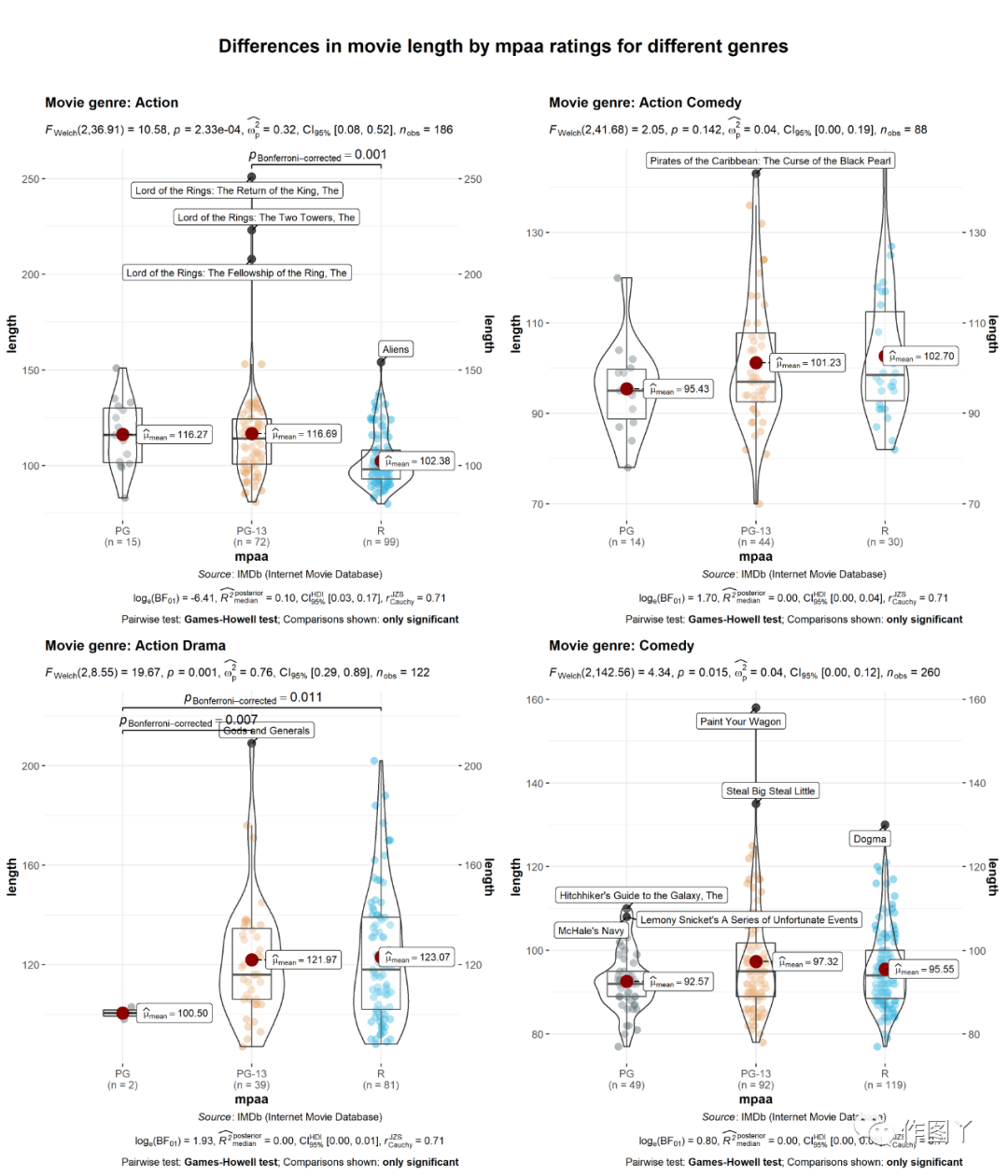
(1)ggbetweenstats:小提琴图,箱形图
此函数用于创建小提琴图、箱形图或组间或组内比较的组合图。
此外,该函数还有一个grouped_变量,可以方便地在单个分组变量上重复相同的操作。
# for reproducibilityset.seed(123)# plotggstatsplot::grouped_ggbetweenstats( data = dplyr::filter( .data = ggstatsplot::movies_long, genre %in% c("Action", "Action Comedy", "Action Drama", "Comedy") ), x = mpaa, y = length, grouping.var = genre, # 分组变量 outlier.tagging = TRUE, #是否需要标记离群值 outlier.label = title, # 用于标记离群值的变量 outlier.coef = 2, ggsignif.args = list(textsize = 4, tip_length = 0.01), p.adjust.method = "bonferroni", #p值校正的方法 #添加新的组间 ggplot.component = list(ggplot2::scale_y_continuous(sec.axis = ggplot2::dup_axis())), title.prefix = "Movie genre", caption = substitute(paste(italic("Source"), ": IMDb (Internet Movie Database)")), palette = "default_jama", package = "ggsci", plotgrid.args = list(nrow = 2), title.text = "Differences in movie length by mpaa ratings for different genres")
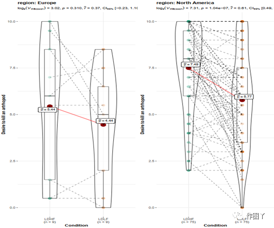
(2)ggwithinstats
ggbetweenstats函数有一个用于重复度量设计的相同的孪生函数ggwithinstats,两个函数以相同的参数运行,但ggbetweenstats引入了一些小的调整,以正确地可视化重复度量设计。
从下面的例子中可以看出,结构的唯一区别是,ggbetweenstats通过路径将
重复度量连接起来,以突出数据类型。
# common setupset.seed(123)# plotggstatsplot::grouped_ggwithinstats( data = dplyr::filter( .data = ggstatsplot::bugs_long, region %in% c("Europe", "North America"), condition %in% c("LDLF", "LDHF") ), x = condition, y = desire, type = "np", #non-parametric statistics xlab = "Condition", ylab = "Desire to kill an artrhopod", grouping.var = region, outlier.tagging = TRUE, outlier.label = education)
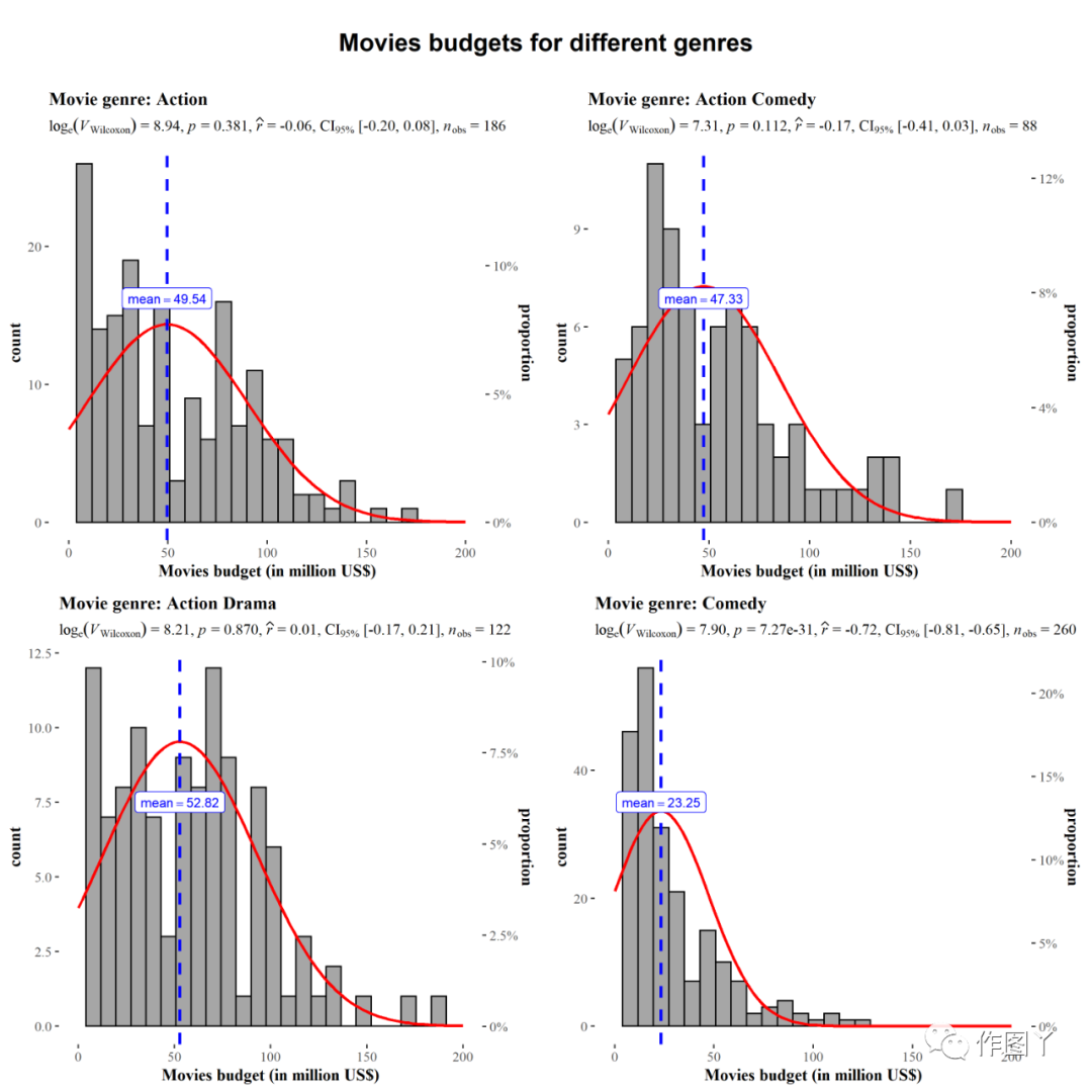
(3)gghistostats
gghiststats作用:可视化单个变量的分布,并通过一个样本测试检查其均值是否与指定值显著不同。
该函数还有一个grouped _变量,可以方便地在单个分组变量上重复相同的操作。
# for reproducibilityset.seed(123)# plotggstatsplot::grouped_gghistostats( data = dplyr::filter( .data = ggstatsplot::movies_long, genre %in% c("Action", "Action Comedy", "Action Drama", "Comedy") ), x = budget, test.value = 50, xlab = "Movies budget (in million US$)", type = "nonparametric", grouping.var = genre, # grouping variable normal.curve = TRUE, # superimpose a normal distribution curve normal.curve.args = list(color = "red", size = 1), title.prefix = "Movie genre", ggtheme = ggthemes::theme_tufte(), # modify the defaults from `ggstatsplot` for each plot ggplot.component = ggplot2::scale_x_continuous( breaks = seq(0, 200, 50), limits = (c(0, 200)) ), plotgrid.args = list(nrow = 2), title.text = "Movies budgets for different genres")
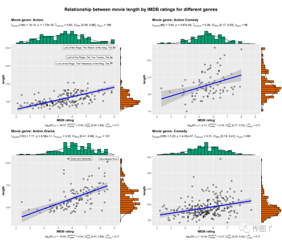
(4)ggscatterstats
此函数用于创建散点图,其边缘分布覆盖在坐标轴上,并在副标题中显示统计测试的结果。
此外,该函数还有一个groupped_变量,可以方便地在单个分组变量上重复相同的操作。
# for reproducibilityset.seed(123)# plotggstatsplot::grouped_ggscatterstats( data = dplyr::filter( .data = ggstatsplot::movies_long, genre %in% c("Action", "Action Comedy", "Action Drama", "Comedy") ), x = rating, y = length, grouping.var = genre, # grouping variable label.var = title, label.expression = length > 200, xlab = "IMDB rating", title.prefix = "Movie genre", ggtheme = ggplot2::theme_grey(), ggplot.component = list( ggplot2::scale_x_continuous(breaks = seq(2, 9, 1), limits = (c(2, 9))) ), plotgrid.args = list(nrow = 2), title.text = "Relationship between movie length by IMDB ratings for different genres")
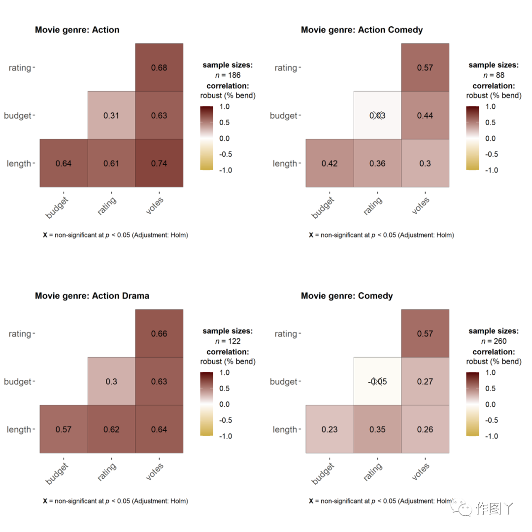
(5)ggcorrmat
ggcorrmat函数用于绘制相关图(一个相关系数矩阵)。仅仅遵循默认值本身就可以生成可以发布的相关矩阵。
如果所选变量中存在NA,图例将显示用于相关性测试的最小、中位数和最大对数。
# for reproducibilityset.seed(123)# plotggstatsplot::grouped_ggcorrmat( data = dplyr::filter( .data = ggstatsplot::movies_long, genre %in% c("Action", "Action Comedy", "Action Drama", "Comedy") ), type = "robust", # correlation method cor.vars = length:votes, colors = c("#cbac43", "white", "#550000"), grouping.var = genre, # grouping variable matrix.type = "lower", # type of visualization matrix title.prefix = "Movie genre", plotgrid.args = list(nrow = 2))
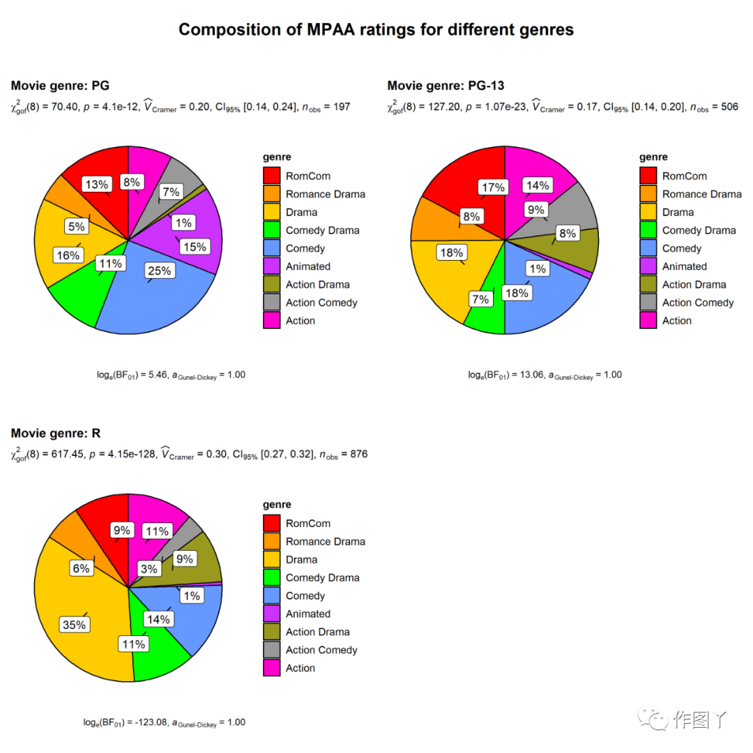
(6)ggpiestats
该函数用于绘制饼状图,并将列联表分析(受试者间设计的皮尔逊卡方检验和受试者内设计的麦克内马卡方检验)的结果包含在图的副标题中。如果只输入一个类别变量,单样本比例检验(即卡方拟合优度检验)的结果将显示为副标题。
# for reproducibilityset.seed(123)# plotggstatsplot::grouped_ggpiestats( data = ggstatsplot::movies_long, x = genre, grouping.var = mpaa, # grouping variable title.prefix = "Movie genre", # prefix for the faceted title label.repel = TRUE, # repel labels (helpful for overlapping labels) package = "ggsci", # package from which color palette is to be taken palette = "default_ucscgb", # choosing a different color palette title.text = "Composition of MPAA ratings for different genres")
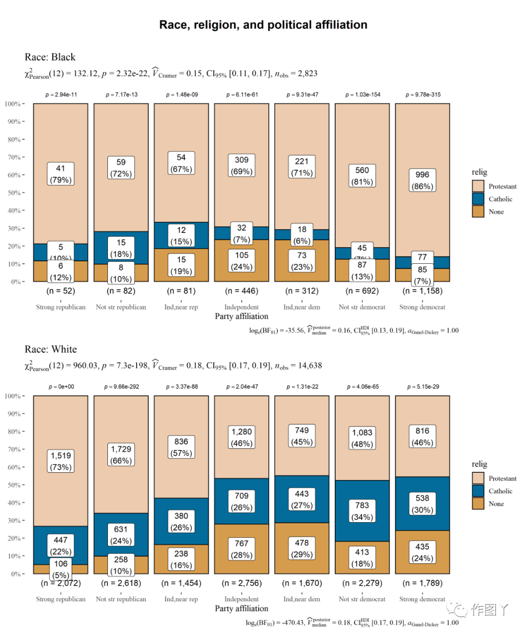
(7)ggbarstats:分组条形图
# setupset.seed(123)# smaller datasetdf <- dplyr::filter( .data = forcats::gss_cat, race %in% c("Black", "White"), relig %in% c("Protestant", "Catholic", "None"), !partyid %in% c("No answer", "Don't know", "Other party") )# plotggstatsplot::grouped_ggbarstats( data = df, x = relig, y = partyid, grouping.var = race, title.prefix = "Race", label = "both", xlab = "Party affiliation", package = "wesanderson", palette = "Darjeeling2", ggtheme = ggthemes::theme_tufte(base_size = 12), ggstatsplot.layer = FALSE, title.text = "Race, religion, and political affiliation", plotgrid.args = list(nrow = 2))
(1)ggstatsplot是ggplot2包的扩展,用于绘制常用统计检验图形。
(2)ggstatsplot应用类型广泛,不仅可以调节背景颜色,也可以分组绘图进行图形拼接。
(3)ggstatsplot可以展示统计检验的细节信息也是其强大之处。
- 本文固定链接: https://maimengkong.com/image/1244.html
- 转载请注明: : 萌小白 2022年10月5日 于 卖萌控的博客 发表
- 百度已收录