这一周R语言学习,记录如下。
01
多图排列组合
patchwork包可以实现多图排列组合,并且功能强大、操作灵活。
# 多图排列组合
library(tidyverse)
library(patchwork)
theme_set(theme_light)
dat <- palmerpenguins::penguins %>% filter(!is.na(sex))
dat %>% View
# 使用patchwork包进行多图排列组合
# 第1个图
point_plot <- dat %>%
ggplot(aes(bill_length_mm, flipper_length_mm, fill = sex)) +
geom_jitter(size = 3, alpha = 0.5, shape = 21)
point_plot
# 第2个图
point_plot2 <- dat %>%
ggplot(aes(bill_length_mm, bill_depth_mm, fill = sex)) +
geom_jitter(size = 3, alpha = 0.5, shape = 21)
point_plot2
# 第3个图
# plot_plot is obviously a fun name
boxplot_plot <- dat %>%
ggplot(aes(x = body_mass_g, fill = sex)) +
geom_boxplot
boxplot_plot
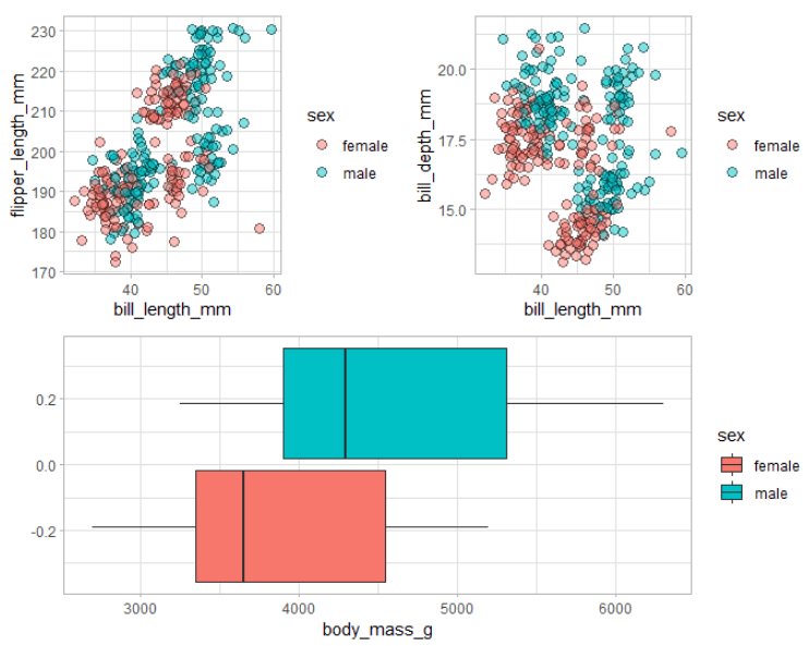
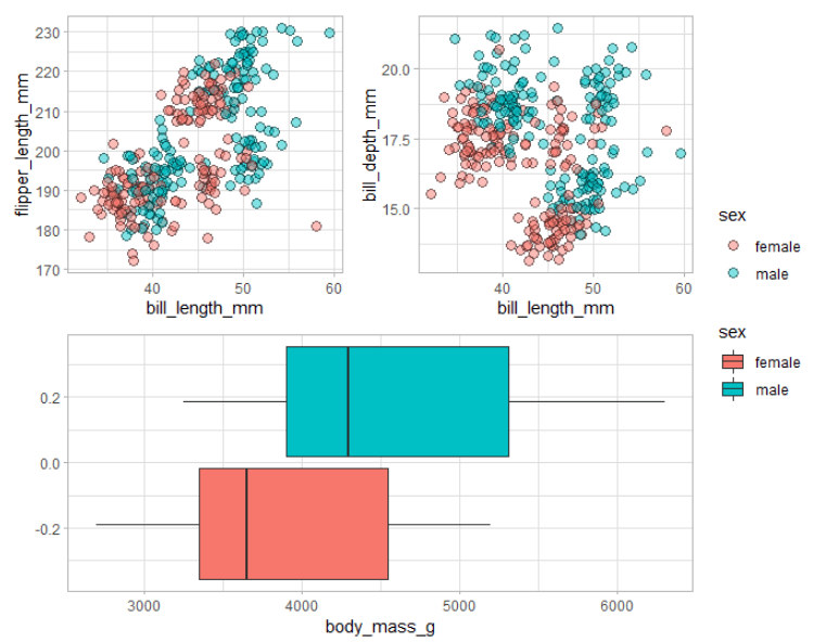
# 上面3个图排列和组合
# 使用patchwork包
p <- (point_plot + point_plot2) / boxplot_plot
p
# 微调
# 图例管理
p + plot_layout(guides = "collect")
结果图
02
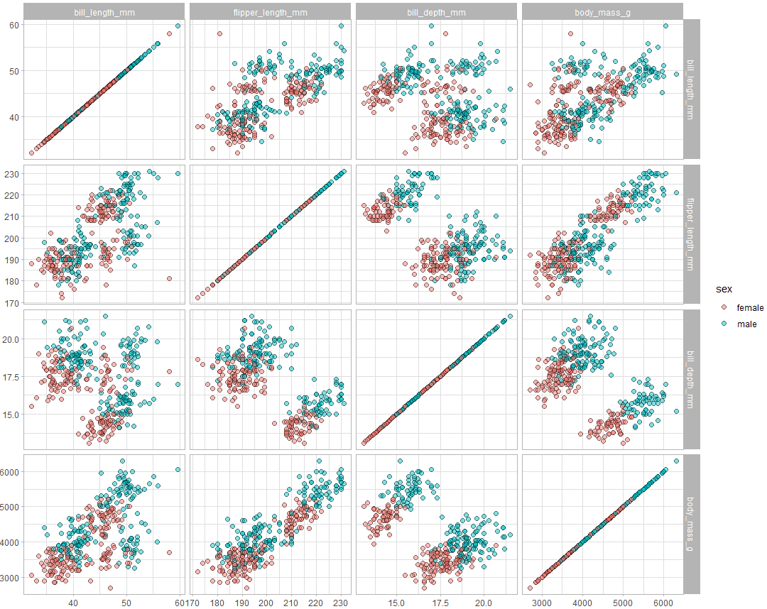
使用ggforce包创建Subplots
ggforce包的facet_matrix函数简易创建Subplots。
library(ggforce)
dat %>%
ggplot(aes(x = .panel_x, y = .panel_y, fill = sex)) +
geom_point(alpha = 0.5, size = 2, shape = 21) +
facet_matrix(
vars(bill_length_mm, flipper_length_mm, bill_depth_mm, body_mass_g)
)
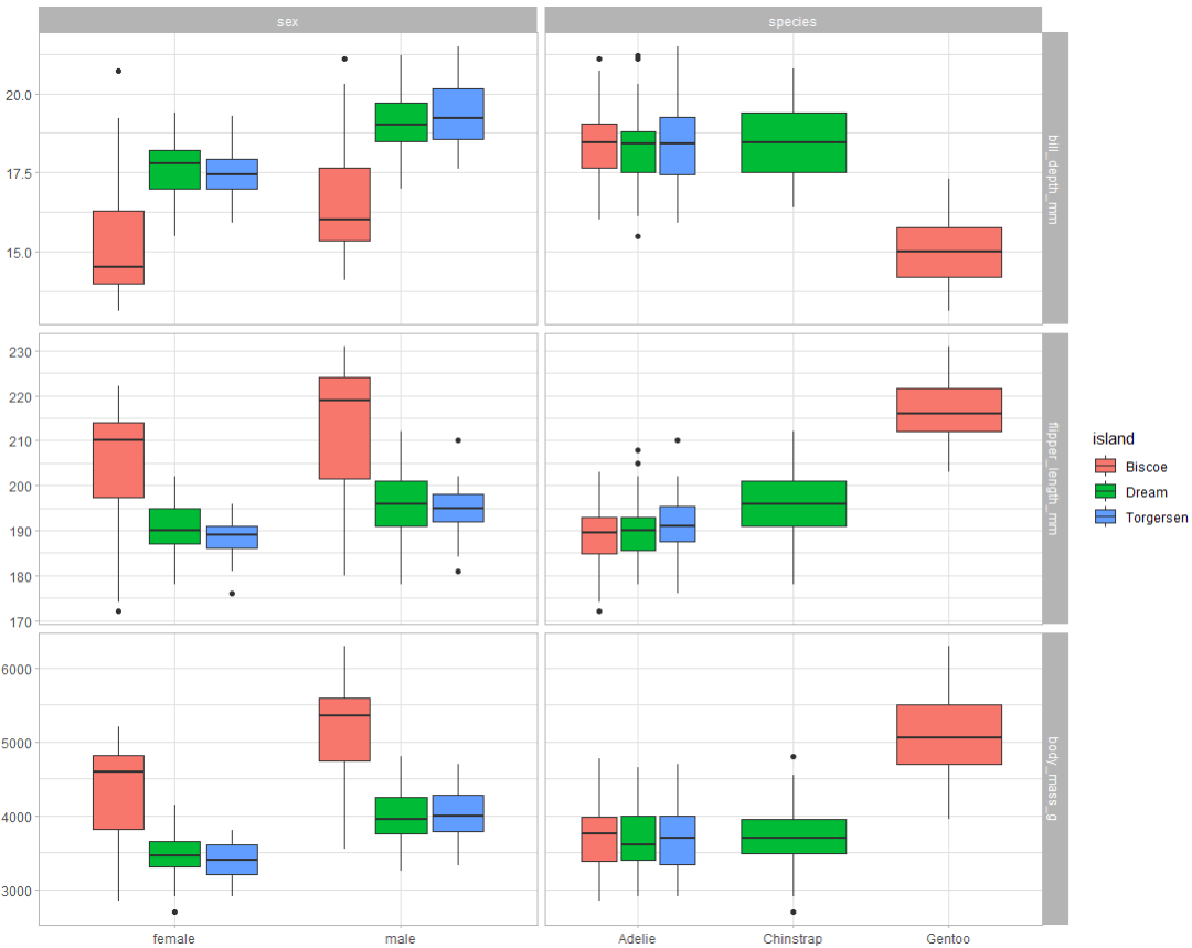
dat %>%
ggplot +
geom_boxplot(
aes(
x = .panel_x,
y = .panel_y,
fill = island,
group= interaction(.panel_x, island)
)
) +
facet_matrix(
cols = vars(sex, species),
rows = vars(bill_depth_mm:body_mass_g)
)
结果图
03
RStudio与Github协同
RStudio与Github协同工作,进行代码管理。
1 准备工作:
1)安装R和RStudio
2)安装Git
3)注册Github账号
如下图,我的Github账号:wangluqing
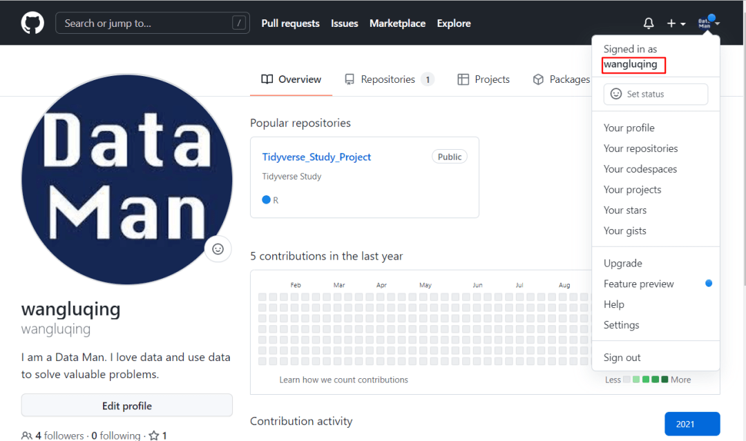
我的Github:
https://github.com/wangluqing
2 配置操作
1)生成秘钥
打开git bash,参考命令
$ git config -- globaluser.name "wanglq"
$ git config -- globaluser.email wangluqing360@ 163.com
$ git config -- globaluser.name
$ git config -- globaluser.email
$ git config -- list
ssh-keygen -t rsa -C "wangluqing360@163.com"
2)配置秘钥
复制上面中生成的 id_rsa.pub 中的内容,之后登陆到 GitHub,在右上角的头像上点击 Settings - SSH and GPG keys,点击右边的 New SSH Key,然后将复制好的内容粘贴进去,标题自己随意取一个,比如 ds key,这样就完成了远程端的配置。
3)测试连接
在 git bash,输入如下命令
ssh-Tgit@ github. com
结果
3 RStudio与Github协同
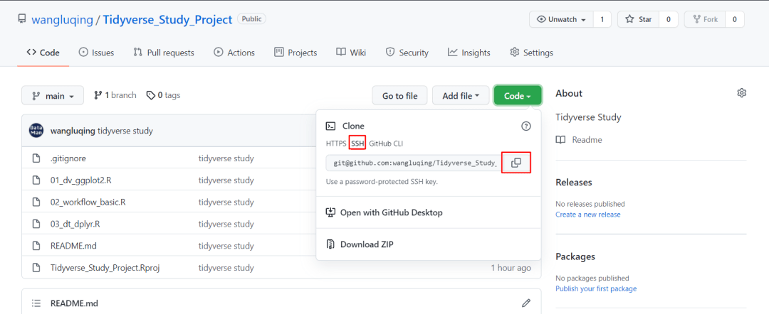
1)登录Github,创建一个项目库,例如:Tidyverse_Study_Project
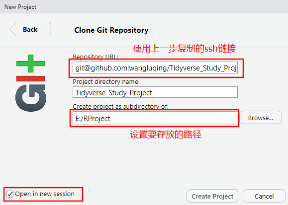
2)打开项目库,复制ssh链接,如下图:
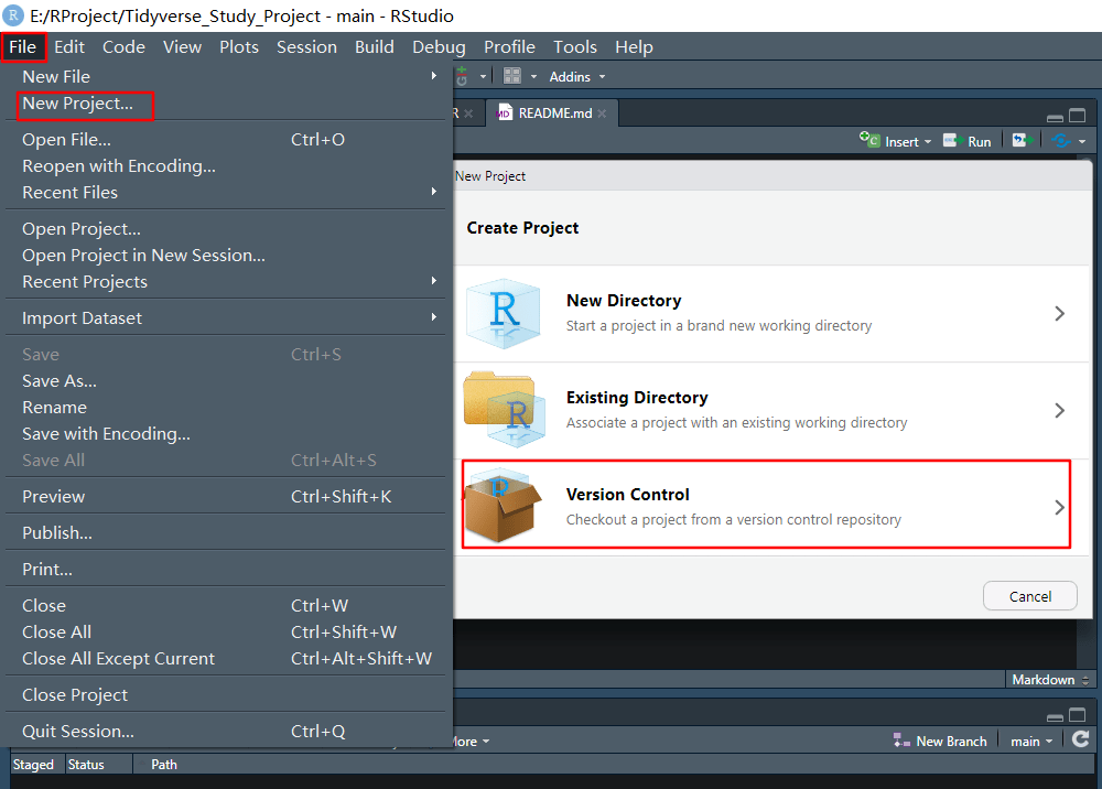
3)打开RStudio软件,选择使用版本控制创建项目,如下图:
项目创建成功后,就可以看到如下界面:
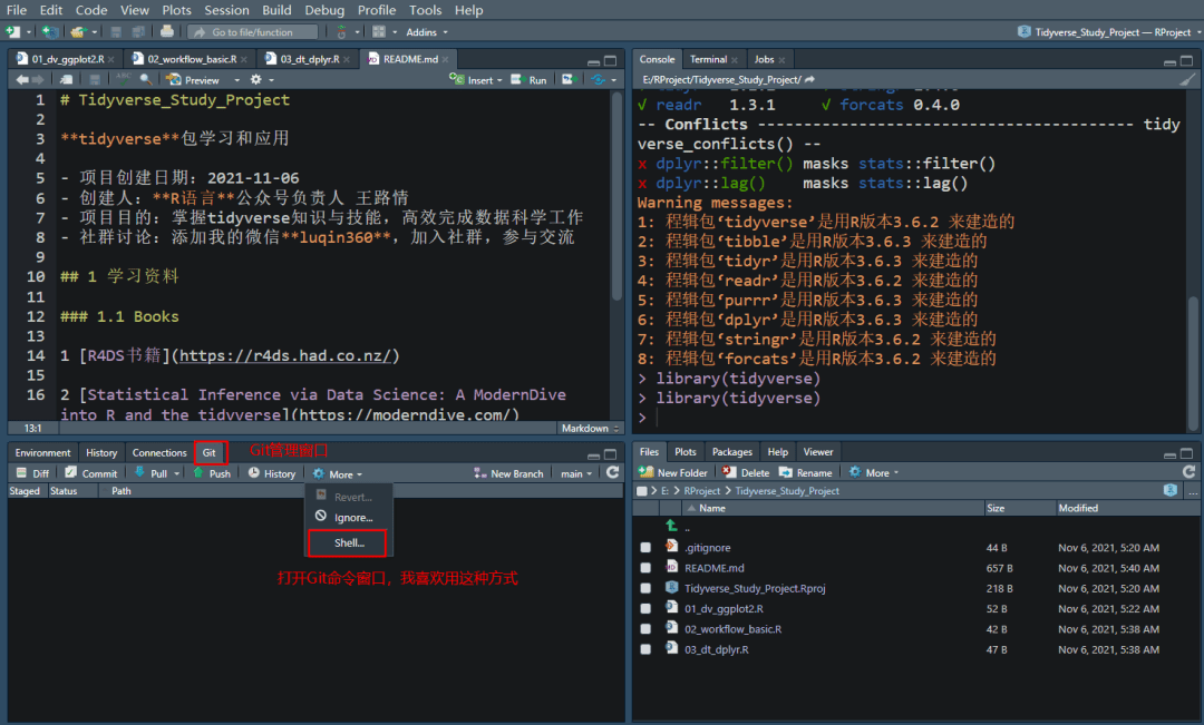
我的这个界面布局做了配置以及在项目下面创建了一些R脚本。
4)项目建设和版本管理
我们根据项目的任务和目标,在项目库下面创建一系列R脚本,每次创建完后,调试成功通过后,请同步到Github。
打开Shell,执行如下命令就可以了
git status
git add.
git commit -m 'tidyverse study'
git push
push成功后,就可以在Github对应项目库下查看相应代码了。
我创建了 R语言群,可以扫描下方二维码,备注:姓名-R语言,加我微信,进入 R语言群,一起讨论。
04
tidyverse代码学习
tidyverse包是我每天工作都要用到的R语言包。我喜欢 代码学习法,即通过阅读、编写、修改、迁移代码等多种方式来学习知识和技能。
tidyverse包学习的一份代码,总结和巩固常用函数的使用方法和实现功能。
####################
# tidyverse学习代码片段
####################
library(tidyverse)
diamonds %>%
group_by(clarity) %>%
summarise(
m = mean(price)
) %>%
ungroup
# ggplot包内置的数据集
data(package = "ggplot2")
glimpse(diamonds)
str(diamonds)
diamonds %>%
slice_head(n = 100) %>%
View
?diamonds
# dplyr包
# mutate
diamonds %>%
mutate(
JustOne = 1,
Values = "something",
Simple = TRUE
) %>%
slice_tail(n = 100) %>%
View
diamonds %>%
mutate(
price200 = price - 200
) %>%
slice_head(n = 100) %>%
View
diamonds %>%
mutate(
price200 = price - 200,
price20perc = price * 0.20,
price20percoff = price * 0.80,
pricepercarat = price / carat,
pizza = depth ^ 2
) %>%
slice_sample(n = 10) %>%
View
diamonds1 <- diamonds %>%
mutate(
price200 = price - 200,
price20perc = price * 0.20,
price20percoff = price * 0.80,
pricepercarat = price / carat,
pizza = depth ^ 2
) %>%
slice_sample(n = 10)
diamonds %>%
mutate(m = mean(price)) %>%
slice_head(n = 100) %>%
View
diamonds %>%
mutate(
m = mean(price),
sd = sd(price),
med = median(price)
) %>%
slice_head(n = 100) %>%
View
# 使用recode函数对变量取值做重编码操作
diamonds %>%
mutate(
cut_new = recode(
cut,
"Fair"= "Okay",
"Ideal"= "IDEAL"
)
) %>%
slice_head(n = 100) %>%
View
Sex <- factor(c( "male", "m", "M", "Female", "Female", "Female"))
TestScore <- c( 10, 20, 10, 25, 12, 5)
dataset <- tibble(Sex, TestScore)
str(dataset)
dataset %>%
mutate(Sex_new = recode(Sex,
"m"= "Male",
"M"= "Male",
"male"= "Male"))
# summarize函数
diamonds %>%
summarise(avg_price = mean(price))
diamonds %>%
summarise(
avg_price = mean(price),
dbl_price = 2* mean(price),
random_add = 1+ 2,
avg_carat = mean(carat),
stdev_price = sd(price)
) %>%
slice_head(n = 100) %>%
View
# group_by函数和ungroup函数
ID <- c( 1: 50)
Sex <- rep(c( "male", "female"), 25)
Age <- c( 26, 25, 39, 37, 31, 34, 34, 30, 26, 33,
39, 28, 26, 29, 33, 22, 35, 23, 26, 36,
21, 20, 31, 21, 35, 39, 36, 22, 22, 25,
27, 30, 26, 34, 38, 39, 30, 29, 26, 25,
26, 36, 23, 21, 21, 39, 26, 26, 27, 21)
Score <- c( 0.010, 0.418, 0.014, 0.090, 0.061, 0.328, 0.656, 0.002, 0.639, 0.173,
0.076, 0.152, 0.467, 0.186, 0.520, 0.493, 0.388, 0.501, 0.800, 0.482,
0.384, 0.046, 0.920, 0.865, 0.625, 0.035, 0.501, 0.851, 0.285, 0.752,
0.686, 0.339, 0.710, 0.665, 0.214, 0.560, 0.287, 0.665, 0.630, 0.567,
0.812, 0.637, 0.772, 0.905, 0.405, 0.363, 0.773, 0.410, 0.535, 0.449)
data <- tibble(ID, Sex, Age, Score)
data %>%
group_by(Sex) %>%
summarise(
m = mean(Score),
s = sd(Score),
n = n
) %>%
View
data %>%
group_by(Sex) %>%
mutate(m = mean(Score)) %>%
ungroup
# filter函数
diamonds %>%
filter(cut == "Fair") %>%
slice_head(n = 100) %>%
View
diamonds %>%
filter(cut % in% c( "Fair", "Good"), price <= 600) %>%
slice_head(n = 100) %>%
View
diamonds %>%
filter(cut == "Fair", cut == "Good", price <= 600) %>%
slice_head(n = 100) %>%
View
# select函数
diamonds %>%
select(cut, color) %>%
slice_head(n = 100) %>%
View
diamonds %>%
select(-( 1: 5)) %>%
slice_head(n = 100) %>%
View
diamonds %>%
select(x, y, z, everything) %>%
slice_head(n = 100) %>%
View
diamonds %>%
arrange(cut) %>%
slice_head(n = 100) %>%
View
# count函数
diamonds %>%
count(cut)
# 等价于
diamonds %>%
group_by(cut) %>%
count(cut)
# 等价于
diamonds %>%
group_by(cut) %>%
summarise(n = n)
# rename函数
diamonds %>%
rename(PRICE = price) %>%
slice_head(n = 100) %>%
View
# 等价于
diamonds %>%
mutate(
PRICE = price
) %>%
select(- price) %>%
slice_head(n = 100) %>%
View
# row_number函数
practice <-
tibble(Subject = rep(c( 1, 2, 3), 8),
Date= c( "2019-01-02", "2019-01-02", "2019-01-02",
"2019-01-03", "2019-01-03", "2019-01-03",
"2019-01-04", "2019-01-04", "2019-01-04",
"2019-01-05", "2019-01-05", "2019-01-05",
"2019-01-06", "2019-01-06", "2019-01-06",
"2019-01-07", "2019-01-07", "2019-01-07",
"2019-01-08", "2019-01-08", "2019-01-08",
"2019-01-01", "2019-01-01", "2019-01-01"),
DV = c(sample( 1: 10, 24, replace = TRUE)),
Inject = rep(c( "Pos", "Neg", "Neg", "Neg", "Pos", "Pos"), 4))
practice %>%
mutate(
Session = row_number
) %>% View
practice %>%
group_by(Subject, Inject) %>%
mutate(Session = row_number) %>%
View
# ifelse函数
practice %>%
mutate(Health = ifelse(Subject == 1,
"sick",
"healthy")) %>%
View
每个代码片段具体可以做什么,你可以一边审核一边做运行与写解释,遇到问题可以来R语言群讨论。
05
探索性数据分析
原始数据入手,采用数字化和可视化方式,对数据做探索性分析
助于对数据的理解和认识
基本思路:通过汇总统计和图形表示,以发现模式、异常和检验假设
# R包
library(tidyverse)
library(DataExplorer)
# 数据集
dim(gss_cat)
str(gss_cat)
# 1) 数据集概览
gss_cat %>% glimpse
# 2) 数据集简要
gss_cat %>% introduce
# 3) 数据简要信息可视化
gss_cat %>% plot_intro
# 4) 变量缺失率分析
gss_cat %>% plot_missing
gss_cat %>% profile_missing
# 5) 连续变量可视化
gss_cat %>% plot_density # 密度曲线图
gss_cat %>% plot_histogram # 直方图
# 6) 类别变量可视化
gss_cat %>% plot_bar # 条形图
# 7) 相关性可视化图
gss_cat %>% plot_correlation
gss_cat %>% plot_correlation(maxcat = 5)
# 8) 探索性分析报告
gss_cat %>%
create_report(
output_file = "gss_survey_data_profile_report",
output_dir = "./report/",
y= "rincome",
report_title = "EDA Report"
)
部分结果图

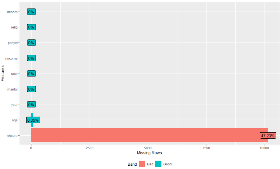
(完整结果,请运行代码自测)
06
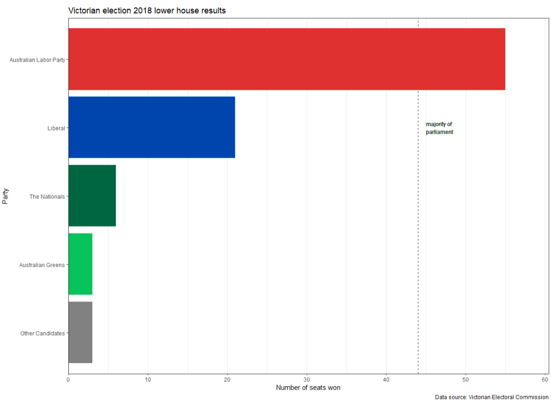
制作优美的条形图
条形图,商业分析或者报告中常用的一种图形表示。
我们在做图的时候,要根据 变量集的类型、个数、取值以及想通过数据表达什么信息等,综合考虑选择合适图形类型。
优美的图形,就好比画画,是不断修改和打磨而成。
library(tidyverse)
election_data <- tribble(
~party, ~seats_won,
"Australian Greens", 3,
"Australian Labor Party", 55,
"Liberal", 21,
"The Nationals", 6,
"Other Candidates", 3
)
election_data_sorted <- election_data %>%
mutate(party = fct_reorder(party, seats_won, .desc = TRUE))
ggplot(election_data_sorted,
aes(x = seats_won, y = party, fill = party)) +
geom_vline(xintercept = 44, linetype = 2, colour = "grey20") +
geom_text(x = 45, y = 4, label = "majority of\nparliament",
hjust = 0, size = 11* 0.8/ .pt, colour = "grey20") +
geom_col +
scale_x_continuous(expand = expansion(mult = c( 0, 0.1))) +
scale_y_discrete(limits = rev) +
scale_fill_manual(breaks = c( "Australian Labor Party", "Liberal", "The Nationals",
"Australian Greens", "Other Candidates"),
values = c( "#DE3533", "#0047AB", "#006644",
"#10C25B", "#808080")) +
labs(x = "Number of seats won",
y = "Party",
title = "Victorian election 2018 lower house results",
caption = "Data source: Victorian Electoral Commission") +
theme_bw +
theme(panel.grid.major.y = element_blank,
legend.position = "off")
ggplot(election_data_sorted,
aes(x = seats_won,
xend = 0,
y = party,
yend = party,
colour = party)) +
geom_segment(size = 1.5) +
geom_point(size = 3) +
scale_x_continuous(expand = expansion(mult = c( 0, 0.1))) +
scale_y_discrete(limits = rev) +
scale_colour_manual(breaks = c( "Australian Labor Party", "Liberal", "The Nationals",
"Australian Greens", "Other Candidates"),
values = c( "#DE3533", "#0047AB", "#006644",
"#10C25B", "#808080")) +
labs(x = "Number of seats won",
y = "Party",
title = "Victorian election 2018 lower house results",
caption = "Data source: Victorian Electoral Commission") +
theme_bw +
theme(panel.grid.major.y = element_blank,
legend.position = "off")
结果图:
- 本文固定链接: https://maimengkong.com/image/1044.html
- 转载请注明: : 萌小白 2022年6月27日 于 卖萌控的博客 发表
- 百度已收录