作者:Bruno Rodrigues
原文链接:https://www.brodrigues.co/blog/2018-10-05-ggplot2_purrr_officer/
来源:R语言

最近我面临以下的问题:创建数以百计的图片以便我们的客户仍旧可以编辑。这意味着我需要把图表导出到Excel、PPT或者其它客户熟悉的工具,而不是像往常那样把图片直接以pdf或者png形式导出。尽管我还是希望使用R解决这个问题,因为我可以进行一直以来的操作,当我需要完成重复性任务时,比如生成上百张图,就像一系列国家的地图,并且每个国家单独制作一张。这是我在前一篇博客里面讨论的内容, Make ggplot2 purrr
因此,经过上网搜寻,我发现了{officer}包,这个包允许你把对象放在Microsoft文件中。比如,可编辑图放在ppt文件中。这就是我将要在这篇博客中展示的。
先从装载需要的包开始:
1library("tidyverse")
2library("officer")
3library("rvg")
然后,我将使用“时间使用”调查的数据,这数据我在前一篇博客中Going from a human readable Excel file to a machine-readable csv with {tidyxl}(翻译)有讨论。
你可以在这里下载数据。
让我们导入并且预处理数据吧!
1time_use <- rio::import("clean_data.csv")
2
3
4time_use <- time_use %>%
5filter(population %in% c("Male", "Female")) %>%
6filter(activities %in% c("Personal care", "Sleep", "Eating",
7"Employment", "Household and family care")) %>%
8group_by(day) %>%
9nest()
我只保留了两类:“Male”和“Female”,以及5项活动。接着按照day分组并把其余的nested在data中。以下就是呈现的状况:
1time_use
1## # A tibble: 3 x 2
2## day data
3## <chr> <list>
4## 1 Year 2014_Monday til Friday <tibble [10 × 4]>
5## 2 Year 2014_Saturday <tibble [10 × 4]>
6## 3 Year 2014_Sunday <tibble [10 × 4]>
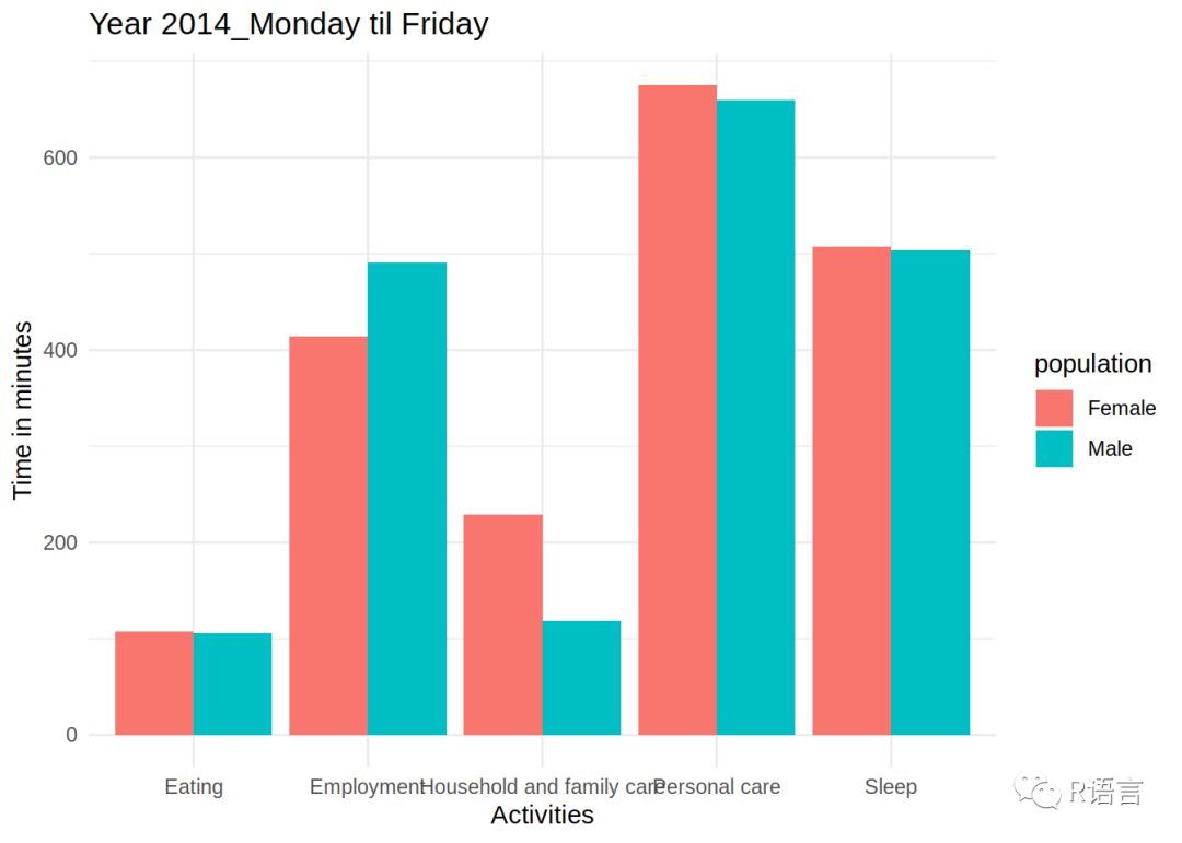
正如展现的那样,'time_use'是一个有两列的tibble,第一列'day'包含了days,第二列'data'是一个类型列,并且列中的每个元素是自身的tibbles。让我们看看其中一个的内容:
1time_use$data[1]
1## [[1]]
2## # A tibble: 10 x 4
3## population activities time time_in_minutes
4## <chr> <chr> <chr> <int>
5## 1 Male Personal care 11:00 660
6## 2 Male Sleep 08:24 504
7## 3 Male Eating 01:46 106
8## 4 Male Employment 08:11 491
9## 5 Male Household and family care 01:59 119
10## 6 Female Personal care 11:15 675
11## 7 Female Sleep 08:27 507
12## 8 Female Eating 01:48 108
13## 9 Female Employment 06:54 414
14## 10 Female Household and family care 03:49 229
现在可以使用以下的代码为每一天绘制图了:
1my_plots <- time_use %>%
2mutate(plots = map2(.y = day, .x = data, ~ggplot(data = .x) + theme_minimal() +
3geom_col(aes(y = time_in_minutes, x = activities, fill = population),
4position = "dodge") +
5ggtitle(.y) +
6ylab("Time in minutes") +
7xlab("Activities")))
这些步骤在之前的博客中 Make ggplot2 purrr都很详细。查看my_plots:
1my_plots
1## # A tibble: 3 x 3
2## day data plots
3## <chr> <list> <list>
4## 1 Year 2014_Monday til Friday <tibble [10 × 4]> <S3: gg>
5## 2 Year 2014_Saturday <tibble [10 × 4]> <S3: gg>
6## 3 Year 2014_Sunday <tibble [10 × 4]> <S3: gg>
最后一列plots是一个列,其中每个元素都是一张图!我们可以看看其中一个:
1my_plots$plots[1]
1## [[1]]
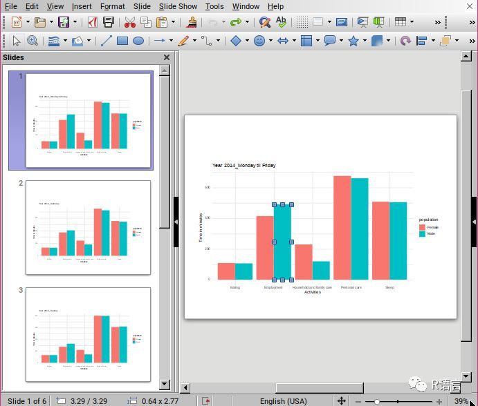
这就是我可以导出为pdf或者png形式的图象。但这不是我想要的,我需要把这些图象导出为ppt可操作的图表。对于每一个图像,我会采用以下操作(包含每个{officer}的文件):
1read_pptx() %>%
2add_slide(layout = "Title and Content", master = "Office Theme") %>%
3ph_with_vg(code = print(one_plot), type = "body") %>%
4print(target = path)
我写了一个包装把一系列的参数结合起来:
1create_pptx <- function(plot, path){
2if(!file.exists(path)) {
3out <- read_pptx()
4} else{
5out <- read_pptx(path)
6}
7
8out %>%
9add_slide(layout = "Title and Content", master = "Office Theme") %>%
10ph_with_vg(code = print(plot), type = "body") %>%
11print(target = path)
12}
该函数有两个参数:plot以及path。plot必须是一个plot对象,就像my_plots里面的plots列包含的plot对象那样。path是我想要保存pptx的路径。
第一行检查文件是否存在,如果是,slides就会添加到存在的文件中,如果不是,一个新的pptx被创建。其余的代码跟文件里面的非常相似。现在,为了创建我的pptx,我只需要把plots列匹配好并且提供一个path:
1map(my_plots$plots, create_pptx, path = "test.pptx")
1## [[1]]
2## [1] "/home/cbrunos/Documents/b-rodrigues.github.com/content/blog/test.pptx"
3##
4## [[2]]
5## [1] "/home/cbrunos/Documents/b-rodrigues.github.com/content/blog/test.pptx"
6##
7## [[3]]
8## [1] "/home/cbrunos/Documents/b-rodrigues.github.com/content/blog/test.pptx"
这是最后的结果:
- 本文固定链接: https://maimengkong.com/image/1263.html
- 转载请注明: : 萌小白 2022年10月16日 于 卖萌控的博客 发表
- 百度已收录